Thursday, 10 December 2015

Road Signs around the Globe

Continuing on from my research into Uk road signs, I've decided to explore road signs found around the world and compare the ways in which they differ from one another.

Different countries have different systems used on the road. Differing in colour, language, typeface and many more.

There are, however, some factors that often stay the same wherever you are around the world. Take STOP signs for example. On the right is a grid of a number of STOP signs around the world. They all use the same shape and colours. This allows any road user to understand the sign even if they don't understand the language used.


Another way in which road signs can differ in different countries is the difference in environment. A sign warning people of kangaroos would not be suitable in most other countries but in Australia it's a must.


Road signs in the US use a different clour system as well as a different typefaces and pictograms. The number for the route is clearly shown using a small red and blue crest with the number on top. This makes it easier for the road user to establish which road goes where.


Road signs in Havana, Cuba

I've come across a series of road signs that have really taken my interest through their use of colour. The signs below use pinks, light greens and bright yellows for wayfinding around town. These, compared with UK road signs, are so much more exciting and aesthetically pleasing yet at the same time are just as functional. 

From these I aim to produce road signs for Leeds using vibrant colours that will still work for legibility and readability but that will suit the energetic environment of Leeds.


Original Pantone range used for all UK road signs


186 C - Warning signs
300 C - Motorways
116 C - Waiting restrictions
346 C - Direction signs
469 C - Tourist signs
370 C - Fire Rendezvous signs
1375 C - Emergency phone labels


Revised Pantone range inspired by Havana road signs


The next step of my project was to implement this revised range of pantone colours onto road and footpath signs to see how they will look on the streets of Leeds.


I have allocated each pantone colour to a specific architectural structure around Leeds. This allows for the wayfinding to be read more easily and quickly as the road user or pedestrian can simply look for a colour, as apposed to a name, to direct them to their desired location.


Tuesday, 8 December 2015

Typesetting


In today's session we have been looking at typesetting, both in a modernist and postmodernist style.

Above is the text of The Mouse's Tale by Lewis Carroll. We have been asked to reset the type in different formats and styles.

           3 Column Grid


Modernist layout

Here I have set the type using a 3 column grid. I have aligned half the text on the right hand side of the third column and the other half on the left. I then changed the typeface to Helvetica.


Postmodernist Layout


I haven't used a grid with this one, typical of postmodernist design. I have designed the text in the shape of a mouse hole. The text is centre aligned and justified below with larger text.


Monday, 7 December 2015

UK Road Signs & Road Markings

My aim for this brief is to explore and redesign the road signs and markings around Leeds city centre. 


Currently the road signs in the Uk follow a strict range of pantone colours. These colours have been chosen for their effectiveness and legibility. However, they are all very basic and dull. 


Original Pantone Range 


 My Revised Pantone Range


Above is my revised range of colours that I will be using for my road signage system. I aimed to create a more vibrant and interesting range of colours. The colours I have chosen will still be affective and legible when used on road signs. I am trying not to affect the legibility of the signage and focus both on practicality and aesthetics.

My redesigned wayfinding system will include my pictograms of iconic buildings in Leeds. The system will guide both road users and pedestrians to the chosen buildings.


Thursday, 3 December 2015

Pictograms - Buildings


For my wayfinding project, I have been exploring pictograms as I will be producing my own to be used on road signs.


In exploring pictograms, I have specifically looked at incredibly simple yet effective examples. What I aim to create is a series of pictograms that resemble well known buildings in Leeds and that can be used on road and pedestrian signs to direct people to them.


Above is a project by Yoon Jae Kim. He has produced a series of pictograms depicting common touristic references.

My Own Pictograms


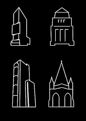
My initial sketches of each of the buildings, simplified into a just a few lines.


My pictograms are of 4 iconic buildings in Leeds; The Broadcasting Tower, The University of Leeds, Sky plaza and Emmanuel church. 


I've presented them in a number of different colour ways to see how I can make the pictograms more legible when on a road sign. I've used colour combinations that I learnt about when exploring colour theory of signage design. Black and yellow being one of the most contrasting combinations.


Inspire by Yoon Jae Kim, I decided to overlay my pictograms with the original image they were drawn from. There isn't much practicality behind these images as the pictogram is slightly lost in the image, but they make for an affective way of presenting the pictograms in an interesting way.


As the pictograms must be legible from a range of distances and in differentiating amounts of sunlight, the next step was to decide what stroke weight would be most appropriate to apply to road signs. My first thought was to make the strokes a lot heavier, and so they would be easier to distinguish from a distance. However, I came across a few problems when i did this; one being that the thicker lines actually changed the shape of the pictogram and therefore compromised with the overall aesthetics. The other, slightly more challenging problem was that the thicker i made the stroke weight, the harder it was to apply to road signs, this is because as I made the pictogram smaller to fit on the sign along side the text, the legibility was severely compromised and simply turned into a dot or smudge. Therefore, I have stuck with the original weight of stroke as it is both suitable for long distances as well as being able to change the size of the pictogram without compromising too much with the legibility.