Fibonacci & Golden Ratio

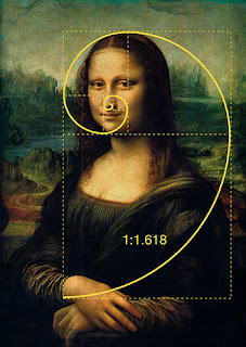
Fibonacci sequence ratio 8:13 links to Golden section. This sequence is not only evident within design but also nature.
1.62
Forms the basis of paper sizes and its principles can be used as a means of achieving balanced designs.8:13
Many ancient cultures from Egyptians to the Greeks used this thinking to gain beautiful designed proportions.Fibonacci sequence ratio 8:13 links to Golden section.

The human face follows the ratio and we find people whose faces are truer to the ratio more attractive.
Classic Renaissance masterpieces, architecture from antiquity, and even human body parts are proportioned based on the ratio down to the fingers themselves.
Canons
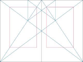
Principles of page layout design used to measure and describe proportions, margins and print area.
Van de Graaf
Tschichold
Golden canon
canon1
My Own Understanding
There is a huge range of rules and regulations within the world of graphic design. However it is completely up to the designers discretion on how closely these rules are followed.
The rules have been designed to allow for things such as consistency, clarity, legibility, aesthetics etc. but this is not to say that defying these rules will result in unsuccessful design. When these rules are broken, it is usually for a purpose. These can include provoking the audience in a certain way or changing the tone of voice.
The Rules and Constraints of Design
"someone once said if you truly hate someone, teach them how to recognise bad kerning"
Kerning is one of the rules that, in my opinion and probably all other opinions, is fundamental in design and needs to always be considered. Bad kerning is one of the most unpleasant things any designer, and a lot of others, have to deal with.
Using the correct Alignment!
Alignment refers to the position and shape of a body of text or image.
The most commonly used alignments found on Microsoft Word are Left, Centred, and Right alignment with an ugly sister alignment being 'Justified'.
Different alignments of text have varying effects on the reader. This is because different alignments mean that the distance and path from one line to the next in a body of text is changed, either made more easy or more difficult. For a body of text to flow, the alignment has to agree with the reader and allow for a fluid and easy read. For example, using centre aligned, the readers eyes will have to readjust in order to read the next line of text, thus making the read less fluid and more difficult. However, in contrast, if the text is aligned to the left, each line of text will start in the same place and therefore make for an easier read.
Widows & Orphans
"A widow is a term for a line of text that belongs to a paragraph and has moved over to the next column. An orphan is similar, but a single word on its own on a line, poor little thing"
Widows & orphans are terms I have only recently been introduced to and I still get confused between the two. However, I do realise how important it is to consider these when using body text in design.
They both can have a huge affect on the aesthetics of a layout or spread. They can create very unpleasant white spaces that needlessly break up the text and also result in a more difficult read.
Have a logical colour palette
A designers choice of colour is very important as it can have a huge affect on the success and impact of the design.
The range of Pantone colours is hugely useful in the world of design and can be extremely helpful in choosing specific colour palettes for specific purposes.
Colours can quite often be made very relevant to the content. For example, the colours shown the on right would be typical of natural imagery such as lakes and landscapes. In contrast, darker colours would be used for more formal or more serious content.
Are Grids Too Constraining??
Grids are commonly misconceived as only involving columns and rows. Grids can be made up of a whole range of terminology...
UNITS
Units are the smallest vertical division of the page, they’re usually too small to house any meaningful content but are a sort of grid to build your grid upon.
COLUMNS
Columns are sets of units grouped together to create workable areas for content. For example, a base twelve unit grid system can be grouped into two columns of six, three columns of four or six columns of two. The latter being the more diverse measure.
REGIONS
Regions are groups of columns that form the basis of a page layout. For example, a base twelve unit grid system with a six column measure can be separated into two regions, one of four columns and one of two columns. This makes up a basic page layout of an article and aside.
BASELINE
A baseline is a typographic system which refers to the horizontal lines letterforms sit on. It’s a useful tool to include in your grids as it provides vertical rhythm for content.
FIELDS
Fields are horizontal divisions of the page. They use the baseline grid as a guide to place elements vertically and divide sections equally.
GUTTERS
Gutters are the empty spaces between elements, either vertically between units, columns and regions or horizontally between fields.
I am yet to come up with a grid that I am happy to use throughout my practice in graphic design however I aim to do so.
Grids will be very helpful in a number of tasks and briefs. The main use being when producing my submission design boards. These boards look a lot more professional and clear when each spread has a common grid system where by all text and imagery is laid upon or within.
Whether I prefer design that is heavily influenced by a grid or whether I prefer design with more freedom I am not too sure of however, at the moment my interest lies in graphics that have that little bit of freedom. I believe that if a grid is more simple and less constraining, that the final design has the power to have more of a lasting effect on the audience, as apposed to a more generic and systematical aesthetic.


No comments:
Post a Comment