Preparing for Screenprint
The decision to use screen printing is informed by the fact that I wanted to include one of my own photographs of the Leeds Town Hall within the final design. This will be the main focus of the print in order to champion the venue as much as the event; as specified in the brief.
This is the half-tone print out that I have then exposed onto a screen. The design includes a photo of the Town Hall within a frame the shape of a cockerel to represent the 2017 Chinese New Year animal.
There is then information on the whereabouts of the Town Hall to put further emphasis on the venue. I had to make sure that the text was a suitable point size for print otherwise there was a danger of it being illegible when printed.
I have then left a large area of blank space at the top as I intend to produce the main title using a different traditional print technique informed by the content.
Paper Choice
The next design decision was to choose the type and colour of the paper. As I am looking at Chinese New Year, I thought that I would choose stock that resemble Chinese culture through colour.
I chose two different reds as well as a yellow/gold colour. These decisions are informed by research into colours and their meanings in China. In China, they look at colours as much more than some other cultures.
Red:
corresponding with fire, symbolises good fortune and joy. Red is found everywhere during Chinese New Year and other holidays and family gatherings.
Yellow:
Yellow, corresponding with earth, is considered the most beautiful and prestigious colour. The Chinese saying, Yellow generates Yin and Yang, implies that yellow is the centre of everything.
I then printed on all three of these colours so that I could compare them and choose which works best.
Wood Block Printing
The art of wood block printing was first discovered in China and was used mainly for religious reasons and so is strongly associated with Buddhism.
In the 1930s the writer and intellectual Lu Xun initiated a new woodblock print movement. He saw the medium as a means of political expression. Lu Xun organized exhibitions with prints by the German artist Kaethe Kollwitz and others. They had a strong influence on Chinese woodblock prints at that time, and many prints in black and white were created with subjects expressing criticism of society and social order.
In the 1940s Chinese woodblock prints became an instrument of political propaganda for the Communist Party. The style was closely adopted to social realism of the former Soviet Union.
This research has informed the decision to print the title using this technique. However, there are a few differences between modern day wood block printing and traditional.
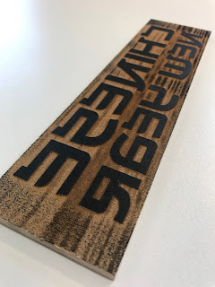
To perform this technique I went down to the wood workshop to be inducted to use the laser cutter. This then allowed me to accurately cut out the type onto a wood block. I had to make sure that I cut out everything but the letters so that they protrude out of the wood and pick up ink.
For the type, I found a typically Chinese font to further strengthen the authenticity of the print so that at first glance, it is clearly celebrating Chinese culture.
When first trying out the wood block technique, I came across an issue with the shape of the wood. As I was using a press, the pressure meant that the ink from the area of wood I didn't want to print made contact with the paper and so made unwanted markings. To tackle this, I went back down to the wood workshop to trim the edges.
Each print after this still had small imperfections, however I think that these marks are typical of the technique and add to the design and authenticity.
Final Resolution
The final resolution was printed on the bright red stock. This was informed by the feedback I received when presenting the final prints. The yellow stock meant that the white ink would almost disappear and so didn't work as a poster. The decision to choose the brighter red over the darker one was informed by the fact that the bright red allowed for all three coloured inks to stand out the most. The darker red, although it looked more prestigious, took away from the design too much and didn't allow the colours to jump off the page. I wanted the design to be a celebration of Chinese culture and so it needed to be bright and vibrant.


No comments:
Post a Comment