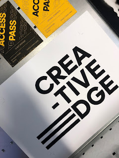
What went well
A couple days ago, I went to Fred Aldous to purchase stock for my print outs. I chose the G F Smith Colour Plan Cetrine colour, as pictured below. One test that went well today was the front and back cover for the programme. This was simply black ink printed onto the yellow stock. The second successful print test were the access passes. I printed two types of these, 'general admission' and 'guest speaker'. I also included a design on the back of them for photoshoot purposes.
One print test that didn't go well was the main body of the programme. I had tried to match up the yellow ink with the yellow paper, however this did not come out well and ended up with a very dark, patchy colour that is used throughout the book.
This problem, along with feedback received from a tutor that suggested I include more of the exhibition itself within the programme. This is part of a bigger idea that basically makes use of the print collateral is a method of visualising the exhibition. This touches on one major issue I am having at the moment which is how to successfully convey and visualise the concept for the judges.
The feedback suggest that I try to include as much about the exhibition as possible within the printed outcomes, and then supporting this with mock ups. This will hopefully come together to form a well explained concept.
I am now currently redesigning the programme content so that it also features more information about each exhibition/campaign. This will also act as a take-away item that could be used outside of the exhibition as well as when walking around the event.


No comments:
Post a Comment