Studio Brief 02 //
Information Design
The aim is to produce a public information leaflet that successfully communicates key aspects of my chosen public info video.
I chose the video called 'Close to the edge' that focuses on adolescents crossing the road safely, not being distracted by friends and phones. The video is very much up beat as it uses a hip hop track by Grandmaster flash. The colours are very vibrant and there is a shot of the teenager wearing Nike trainers. All of these aspects make it clear that the target audience is teenagers. The video tries to be in tune with teenage culture through music and fashion.
From this, I aim to produce an information leaflet about road safety amongst the 16-25 age bracket. There are 3000 road accident fatalities in the UK each year, 27% of these falling within that age bracket. 2/3 of those are male; therefore I will aim my leaflet predominantly at male adolescence.
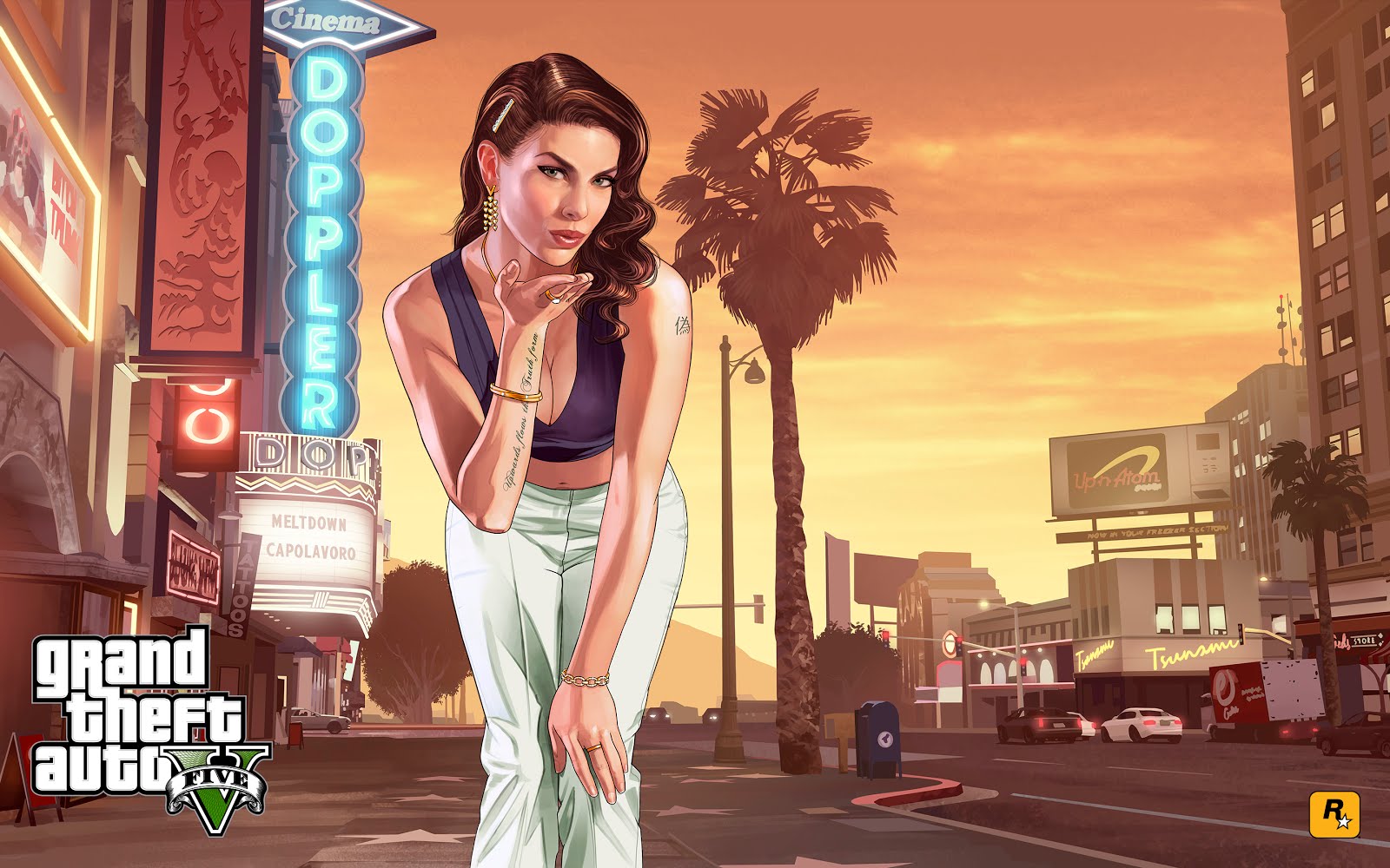
I came across the idea of using the iconic video game Grand Theft Auto to put across my message. Using key aspects of this game will mean that my leaflet will be received by my desired target demographic. The game is also relevant to road safety as it involves a lot of road rage and driving around aimlessly crashing into anything and everything. The game has been criticised for teaching kids a bad lesson, especially concerning what is and isn't acceptable on the roads.
The first detail of the game that I will be using is the iconic typeface. The typeface is very easily recognisable by the target audience as well as being bold enough to stand out on a leaflet.
The next element of the game that is just as iconic is the imagery used on the loading pages. This imagery is colourful and eye catching and will help keep the viewer interested. The cover image is intended to attract male attention.

I've picked a range of imagery that will both appeal to the male demographic, as well as being relevant to road safety.
I have chosen a simple three-fold structure to my leaflet, the front side will include facts and stats about road accident fatalities in the UK in order to scare the reader. The flip-side will include strategies and tips on how to be safe and responsible on the road.
The general message I aim to out across with my leaflet is the slogan 'Life Is Not A Game'.


One criticism received during a critique of the layout above is that some of the smaller text gets lost in the background image. One way I amended this was to give the smaller text a white outline, similar to that of the larger text. This helps the legibility of text and makes it easier to read for the viewer.

I've decided to include an advertisement for a piece of tech called 'telematics'. This technology is very suitable for my target audience as it saves drivers money on their car insurance and students especially are always having money problems and are looking to save wherever they can.
I've also used bullet points to display the advert as it is a quick and easy way of displaying info that takes away any unnecessary text. A simple helvetica regular typeface is used for body text as its clear and legible.


To go with my leaflet, I will also be producing stickers. The sticker will read 'Life is not a game' to further emphasise the message of the leaflet.
Stickers are suitable for my target audience as they attract younger people. They can be stuck on car bumpers, bedroom walls etc. I will be using the vinyl cutter to produce them.

For more information for the reader, I have included a website URL, twitter feeds and youtube channel. All three of these platforms are widely used by my target audience. I have also included a QR code that ideally would be scanned by the readers mobile device and direct them to either a website or an app that will supply further information on road safety.
Envelopes //


For distribution, I will be inserting my leaflet into an envelope of some sort. However, I do not aim to distribute it through letterboxes. My target audience typically will not read a lot of junk that comes through the door, especially if it's in a boring envelope.
The envelope will also include a sticker and possibly a poster.
As a majority of my target audience are students, I will be handing out my leaflet in places of education such as schools, colleges and universities.


As well as the traditional folded envelope, there is also a huge variety of different layouts and formats that an envelope can take. As this is the first element of my design that will be seen, it needs to be engaging and attractive so that it entices the reader to open and view the leaflet itself.
One way of doing this is to create an interactive envelope of some sort. One that will require unfolding in a peculiar way. This will instantly make it seem more appealing as apposed to a boring white or brown envelope that would often signify something nobody wants to read.

I have designed a sleeve to package my leaflet. Inspired by one of the images above, the sleeve is the same length and width of a regular envelope but has a depth of 5mm. I decided on this design due to the fact that with a depth of 5mm, it allows enough room for my leaflet. As i printed my leaflet on 300 GSM stock, it is very thick and would not fit comfortably in a standard envelope. The sleeve also leaves enough room to include the sticker.
The other reason for picking this design is that it makes the overall package look more substantial and will make people more inclined to look inside as they will see that it's not just any flier they get through the letterbox.

This is the very simple template for my sleeve design. On the front, I have added the DVLA emblem however I haven't included the lettering in the logo. This is so that people don't immediately recognise that it's from the DVLA otherwise they may either think it'll be something really dull and uninteresting or maybe even think it's something they don't want to open like a fine. I Thought that I'd mention the free bumper sticker inside on the front just to intrigue the audience even more.


This is the final design. I have used 300 GSM watercolour paper as it is sturdy yet malleable enough to shape and fold. Unfortunately, as this was a late design decision, I could not get a time slot in the print room early enough to get my design printed onto the paper.
No comments:
Post a Comment