In evaluation of Studio Brief 01, I took the opportunity to make the most of the facilities available here at the college. As well as refreshing my memory and skills in screen printing, I also learned how to use the laser cuter which I then used to produce some wood block prints. This was a completely new process for me and one that I enjoyed thoroughly and will be utilising in the future. My aim for this project was to take traditional print one step further than I had done previously which was achieved through the wood block printing. Despite having used screen printing a number of times already on this course, I still experienced a limitation of the process this time round concerning image quality. I chose to screen print a photograph by producing a half-tone image. Unfortunately, a lot of detail in the image was lost when printing, this taught me that there are certain limitations when trying the screen print photography. Having experienced this means that I have now learned from it and will consider it when carrying out the process again. I chose to exhibit my poster in two exhibitions, the end of year show as well as a collective show as this is something I aim to do more of as I progress and something that I need to improve on in terms of getting my work out into the real world.
Studio brief 02 was definitely one of the biggest learning curves of this year and the course in general. I decided to tackle an issue that means a lot to me and has had a huge effect on my life for several years. At first, I was sceptical as to whether I wanted to revolve my work around such a sensitive subject, but looking back I am extremely glad that I did as it was beneficial for both me as a person as well as my development as a designer. Interviewing my own father as research for a project and coming up with real world solutions that could benefit his life as well as thousands of others around the country was an amazing experience and one that I will always aim to recreate. Getting in touch with a national charity such as Parkinson's UK and hearing that they want to see the work I produce was also a unique experience for me and it helped me through the project in terms of engagement. Having someone who is genuinely interested in my work and has the capability to take things further into the real world made the whole process feel a lot more real. The experience resulted in one of my strongest bodies of work so far and so has taught me that the real world aspects of the brief are things that really motivate me to push myself and my work further.
I also too the opportunity to refresh my memory of designing for screen through Experience Design and wire framing. Although this isn't an area of Graphic Design that I am really interested, the skills learned throughout the process are extremely valuable and is beneficial for my progression if I am able to confidently design for screen.
Thursday, 18 May 2017
Wednesday, 17 May 2017
Tuesday, 16 May 2017
Traditional Print - Production
Preparing for Screenprint
The decision to use screen printing is informed by the fact that I wanted to include one of my own photographs of the Leeds Town Hall within the final design. This will be the main focus of the print in order to champion the venue as much as the event; as specified in the brief.
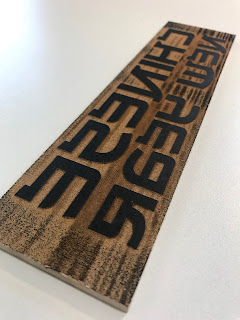
 This is the half-tone print out that I have then exposed onto a screen. The design includes a photo of the Town Hall within a frame the shape of a cockerel to represent the 2017 Chinese New Year animal.
There is then information on the whereabouts of the Town Hall to put further emphasis on the venue. I had to make sure that the text was a suitable point size for print otherwise there was a danger of it being illegible when printed.
I have then left a large area of blank space at the top as I intend to produce the main title using a different traditional print technique informed by the content.
Paper Choice
 The next design decision was to choose the type and colour of the paper. As I am looking at Chinese New Year, I thought that I would choose stock that resemble Chinese culture through colour.
I chose two different reds as well as a yellow/gold colour. These decisions are informed by research into colours and their meanings in China. In China, they look at colours as much more than some other cultures.
Red:
corresponding with fire, symbolises good fortune and joy. Red is found everywhere during Chinese New Year and other holidays and family gatherings.
Yellow:
Yellow, corresponding with earth, is considered the most beautiful and prestigious colour. The Chinese saying, Yellow generates Yin and Yang, implies that yellow is the centre of everything.
I then printed on all three of these colours so that I could compare them and choose which works best.
Wood Block Printing
 The art of wood block printing was first discovered in China and was used mainly for religious reasons and so is strongly associated with Buddhism.
In the 1930s the writer and intellectual Lu Xun initiated a new woodblock print movement. He saw the medium as a means of political expression. Lu Xun organized exhibitions with prints by the German artist Kaethe Kollwitz and others. They had a strong influence on Chinese woodblock prints at that time, and many prints in black and white were created with subjects expressing criticism of society and social order.
In the 1940s Chinese woodblock prints became an instrument of political propaganda for the Communist Party. The style was closely adopted to social realism of the former Soviet Union.
This research has informed the decision to print the title using this technique. However, there are a few differences between modern day wood block printing and traditional.
To perform this technique I went down to the wood workshop to be inducted to use the laser cutter. This then allowed me to accurately cut out the type onto a wood block. I had to make sure that I cut out everything but the letters so that they protrude out of the wood and pick up ink.
For the type, I found a typically Chinese font to further strengthen the authenticity of the print so that at first glance, it is clearly celebrating Chinese culture.
 When first trying out the wood block technique, I came across an issue with the shape of the wood. As I was using a press, the pressure meant that the ink from the area of wood I didn't want to print made contact with the paper and so made unwanted markings. To tackle this, I went back down to the wood workshop to trim the edges.
Each print after this still had small imperfections, however I think that these marks are typical of the technique and add to the design and authenticity.
Final Resolution
The final resolution was printed on the bright red stock. This was informed by the feedback I received when presenting the final prints. The yellow stock meant that the white ink would almost disappear and so didn't work as a poster. The decision to choose the brighter red over the darker one was informed by the fact that the bright red allowed for all three coloured inks to stand out the most. The darker red, although it looked more prestigious, took away from the design too much and didn't allow the colours to jump off the page. I wanted the design to be a celebration of Chinese culture and so it needed to be bright and vibrant.


The decision to use screen printing is informed by the fact that I wanted to include one of my own photographs of the Leeds Town Hall within the final design. This will be the main focus of the print in order to champion the venue as much as the event; as specified in the brief.

There is then information on the whereabouts of the Town Hall to put further emphasis on the venue. I had to make sure that the text was a suitable point size for print otherwise there was a danger of it being illegible when printed.
I have then left a large area of blank space at the top as I intend to produce the main title using a different traditional print technique informed by the content.
Paper Choice

I chose two different reds as well as a yellow/gold colour. These decisions are informed by research into colours and their meanings in China. In China, they look at colours as much more than some other cultures.
Red:
corresponding with fire, symbolises good fortune and joy. Red is found everywhere during Chinese New Year and other holidays and family gatherings.
Yellow:
Yellow, corresponding with earth, is considered the most beautiful and prestigious colour. The Chinese saying, Yellow generates Yin and Yang, implies that yellow is the centre of everything.
I then printed on all three of these colours so that I could compare them and choose which works best.
Wood Block Printing

In the 1930s the writer and intellectual Lu Xun initiated a new woodblock print movement. He saw the medium as a means of political expression. Lu Xun organized exhibitions with prints by the German artist Kaethe Kollwitz and others. They had a strong influence on Chinese woodblock prints at that time, and many prints in black and white were created with subjects expressing criticism of society and social order.
In the 1940s Chinese woodblock prints became an instrument of political propaganda for the Communist Party. The style was closely adopted to social realism of the former Soviet Union.
This research has informed the decision to print the title using this technique. However, there are a few differences between modern day wood block printing and traditional.
To perform this technique I went down to the wood workshop to be inducted to use the laser cutter. This then allowed me to accurately cut out the type onto a wood block. I had to make sure that I cut out everything but the letters so that they protrude out of the wood and pick up ink.
For the type, I found a typically Chinese font to further strengthen the authenticity of the print so that at first glance, it is clearly celebrating Chinese culture.

Each print after this still had small imperfections, however I think that these marks are typical of the technique and add to the design and authenticity.
Final Resolution
The final resolution was printed on the bright red stock. This was informed by the feedback I received when presenting the final prints. The yellow stock meant that the white ink would almost disappear and so didn't work as a poster. The decision to choose the brighter red over the darker one was informed by the fact that the bright red allowed for all three coloured inks to stand out the most. The darker red, although it looked more prestigious, took away from the design too much and didn't allow the colours to jump off the page. I wanted the design to be a celebration of Chinese culture and so it needed to be bright and vibrant.


Working Age UK
Publicity
To demonstrate product, range and distribution I have produced a number of mock ups taking into consideration the audience I want to appeal to and attract.
Bus Advert
The idea to use a bus as a means of communication is informed by the fact that a lot of adverts you see on the back of buses share a similar topic or purpose. Through research and observations I discovered that a lot of the adverts you see on the back of buses are to do with health.

Flyers
I then designed an A5 flyer that would be available in hospitals and doctors surgeries as these are places that people with Parkinson's go for regular check ups. Flyers are appropriate for my target audience as people of the age of 35+ are more inclined to read a flyer or leaflet, more so that a younger audience.
I wanted to keep the flyers simple and stripped back with the sole purpose of making viewers aware that there is an app. Originally, I was going to include tutorials on how to use the app but from feedback, I learned that the tutorial on the app itself is enough.

Instagram
My target audience will most likely already be following the Parkinson's UK social media presence including their Instagram page. This makes it a perfect means of advertising as the only people who will see it are people already involved with the charity and who most likely have the disease. Also, the general age of the people on Instagram are of the target audience I'm aiming my campaign at, which also filters out the older people who would not be interested in the app itself.

Parkinson's Website
Another highly appropriate and efficient means of advertising the app is to feature it on the charity website page. The advert can be found when the user clicks on the 'Online Community' tab. The advert would then be seen straight away by the intended target audience as, again, the people visiting that area of the website will be of a younger age.

Monday, 15 May 2017
Project Development - Campaign
Working Age UK
Inspired by the Alzheimer's Australia campaign, I decided to start to come up with ways in which I could achieve similar things using Parkinson's UK as the driving force.
As my project is aimed towards the young on-set people living with the disease, I decided to produce a logo that represents them as a community. This is to make them feel like there is enough of them for there to be dedicated design towards the community.
I have used the full-round stencil font that Parkinson's UK already uses throughout their branding to make obvious the link between the charity and the sub category of the Working Age UK that this logo represents The aim was to produce something youthful and current that also makes use of existing branding guidelines. This is also what informed the two blue colours used, both separating the two letters.

 Development

Moving on from the logo development, the next stage was to come up with an interchangeable phrase, similar to the Alzheimer's campaign that could be used throughout this campaign as a means of distribution. One thing I wanted to stick to and was informed by my research was to keep the language used as positive. This is due to the fact that existing publicity for the disease is generally a bit depressing.

 I began by playing around with some words and phrases before coming up with two options on the left.
The idea behind these interchangeable phrases is to represent the working-age people of the UK that have Parkinson's and to raise awareness of the fact that it doesn't only effect older people, but that it has effected hundreds of people all over the country who want to hold down a job or who have to take care of their family.
The overall tone of voice is empowering for the younger people with the disease.
The idea was to then transform the concept into a full-blown campaign and to consider how it would be communicated and to whom.
As the campaign revolves around younger people, I decided that an informed and considered means of communication would be social media.
Feedback
- Groups & Communities - events and things to bring them together
- Other charities - How they code messages
- encouraging language directly address them. "you can have..."
- maybe organise an event ? and produce the design for it.
- re-write the brief
- what is the problem?
- what am I trying to achieve in response to the problem
- target audience
- product, range & distribution
- Online community
- Bring working-age people together
Further Development
- a social media tool that brings the working age community together
- tool links with Google Calendar - notifies peoples phones about events
- iPhone app as the "tool"
- working-age UK smartphone app
- notifications feature informed by cognitive side of disease
- Log-in - Home Page - news feed, calendar, contact, profile page
- moving on from the online community idea
- it has already been done
- I want to encourage meeting up in person as opposed to talking on forums
The feedback from the critique session was that I need to specify a stronger aim and purpose and that I need to solve a problem.
The new problem is to bring young on-set people with Parkinson's together in person. Moving on from this, I wanted to come up with a way of making it easier for them to communicate between each other and organise meet ups.
The obvious outcome was to create a smartphone app. This is informed by the age of the target audience.
Smartphone App
- Target Audience - young on-set / working age Parkinson's patients
- specific to the UK
- users looking for events, gatherings etc amongst the community
- also to post their own events
- advertise app on website
- app features : demonstrate reminders
- app regularly reminds user of the functions and features
Inspired by the Alzheimer's Australia campaign, I decided to start to come up with ways in which I could achieve similar things using Parkinson's UK as the driving force.
As my project is aimed towards the young on-set people living with the disease, I decided to produce a logo that represents them as a community. This is to make them feel like there is enough of them for there to be dedicated design towards the community.
I have used the full-round stencil font that Parkinson's UK already uses throughout their branding to make obvious the link between the charity and the sub category of the Working Age UK that this logo represents The aim was to produce something youthful and current that also makes use of existing branding guidelines. This is also what informed the two blue colours used, both separating the two letters.


Moving on from the logo development, the next stage was to come up with an interchangeable phrase, similar to the Alzheimer's campaign that could be used throughout this campaign as a means of distribution. One thing I wanted to stick to and was informed by my research was to keep the language used as positive. This is due to the fact that existing publicity for the disease is generally a bit depressing.


The idea behind these interchangeable phrases is to represent the working-age people of the UK that have Parkinson's and to raise awareness of the fact that it doesn't only effect older people, but that it has effected hundreds of people all over the country who want to hold down a job or who have to take care of their family.
The overall tone of voice is empowering for the younger people with the disease.
The idea was to then transform the concept into a full-blown campaign and to consider how it would be communicated and to whom.
As the campaign revolves around younger people, I decided that an informed and considered means of communication would be social media.
Feedback
- Groups & Communities - events and things to bring them together
- Other charities - How they code messages
- encouraging language directly address them. "you can have..."
- maybe organise an event ? and produce the design for it.
- re-write the brief
- what is the problem?
- what am I trying to achieve in response to the problem
- target audience
- product, range & distribution
- Online community
- Bring working-age people together
Further Development
- a social media tool that brings the working age community together
- tool links with Google Calendar - notifies peoples phones about events
- iPhone app as the "tool"
- working-age UK smartphone app
- notifications feature informed by cognitive side of disease
- Log-in - Home Page - news feed, calendar, contact, profile page
- moving on from the online community idea
- it has already been done
- I want to encourage meeting up in person as opposed to talking on forums
The feedback from the critique session was that I need to specify a stronger aim and purpose and that I need to solve a problem.
The new problem is to bring young on-set people with Parkinson's together in person. Moving on from this, I wanted to come up with a way of making it easier for them to communicate between each other and organise meet ups.
The obvious outcome was to create a smartphone app. This is informed by the age of the target audience.
Smartphone App
- Target Audience - young on-set / working age Parkinson's patients
- specific to the UK
- users looking for events, gatherings etc amongst the community
- also to post their own events
- advertise app on website
- app features : demonstrate reminders
- app regularly reminds user of the functions and features
Wednesday, 10 May 2017
Charity Campaigns
Give Blood
Advertising Campaign for The Red Cross. A three poster ad campaign to be shown on public transport to encourage young people to give blood."This was demonstrated through the development of a continually changing cross and a different maths sum to get people thinking of reasons to give blood. A lot of white space and contrasting bright red colours were you used to give the campaign a contemporary feel."


This concept is incredibly simple but it has qualities that I aim to achieve through my own campaign. The minimal design and use of bright red on a white background makes the poster designs look current, modern and engaging, especially for a younger target audience.


For this new campaign, WWF wanted to raise awareness of the endangerment to the Arctic species by utilising strong imagery with simple text, in keeping with their current style guide. I painted animals onto the ice to act as a physical representation of the vulnerability of their habitat and how crucial the preservation of this is to their survival.


Advertising Campaign for The Red Cross. A three poster ad campaign to be shown on public transport to encourage young people to give blood."This was demonstrated through the development of a continually changing cross and a different maths sum to get people thinking of reasons to give blood. A lot of white space and contrasting bright red colours were you used to give the campaign a contemporary feel."


This concept is incredibly simple but it has qualities that I aim to achieve through my own campaign. The minimal design and use of bright red on a white background makes the poster designs look current, modern and engaging, especially for a younger target audience.
TeamGOSH
Great Ormond street hospital asked TeamGOSH to produce a short animation to help promote a funds campaign. The animation is a good example of another, less conventional yet more current and engaging way of raising awareness for a real world cause. The animation is positive in tone of voice and uses bright colours and friendly characters.
Great Ormond street hospital asked TeamGOSH to produce a short animation to help promote a funds campaign. The animation is a good example of another, less conventional yet more current and engaging way of raising awareness for a real world cause. The animation is positive in tone of voice and uses bright colours and friendly characters.


UNICEF | Student Project
For this new campaign, WWF wanted to raise awareness of the endangerment to the Arctic species by utilising strong imagery with simple text, in keeping with their current style guide. I painted animals onto the ice to act as a physical representation of the vulnerability of their habitat and how crucial the preservation of this is to their survival.
I like the use of water colour paints combined with poster design. The method is very suited to the content and therefore makes the posters have even more impact. From this research, I could look into considering what mediums I use within my own designs.


Alzheimer's Australia
'Turning the unspoken, into the unforgettable'
To help increase awareness and the level of funding afforded to Alzheimer’s Disease and other forms of dementia, Mike Rigby and his team had to create a brand that could cut through the clutter of the charity landscape.
"A brand with a fighting spirit at its heart. A brand designed to create a grass roots movement and galvanize an entire nation."
The campaign is intentionally minimal and simple with the use of only two colours and often only four word phrases.
The identity is:
- Bold
- Simple
- Clear
- Deliberately easy to manage
Created at Interbrand Australia. Strategy, design and motion by Chris Maclean, Dean Christie, Chris Doyle, Chris Lamont, Joao Peres, Jefton Sungkar and Mike Tossetto.


Social Media Presence
Instagram
As part of the campaign and to spread the awareness, they have an Instagram and Facebook account that is regularly updates.
 For my own project, I will be focusing on aiming my campaign at a younger target audience and one way I have thought of to achieve this is to use social media as it is a useful means of communication that is suitable for my target audience.
Below is a series of illustrations that were posted daily for a week for Brain Awareness Week. These fun an colourful illustrations are a prime example of the imagery I aim to use in my own campaign. The tone of voice is playful and positive despite the the cause they are addressing.


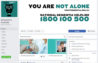 Similarly, with their Facebook page they have used a positive tone of voice and kept a consistent identity using the same two colours.
If I were to compare the effectiveness of both social media platforms, I would say that the Instagram account is a lot better suited due to the format and the fact that it is predominantly imagery which the campaign uses a lot.
This has informed my idea to utilise Instagram with my own campaign.
To help increase awareness and the level of funding afforded to Alzheimer’s Disease and other forms of dementia, Mike Rigby and his team had to create a brand that could cut through the clutter of the charity landscape.
"A brand with a fighting spirit at its heart. A brand designed to create a grass roots movement and galvanize an entire nation."
The campaign is intentionally minimal and simple with the use of only two colours and often only four word phrases.
The identity is:
- Bold
- Simple
- Clear
- Deliberately easy to manage
Created at Interbrand Australia. Strategy, design and motion by Chris Maclean, Dean Christie, Chris Doyle, Chris Lamont, Joao Peres, Jefton Sungkar and Mike Tossetto.


Social Media Presence
As part of the campaign and to spread the awareness, they have an Instagram and Facebook account that is regularly updates.

Below is a series of illustrations that were posted daily for a week for Brain Awareness Week. These fun an colourful illustrations are a prime example of the imagery I aim to use in my own campaign. The tone of voice is playful and positive despite the the cause they are addressing.


If I were to compare the effectiveness of both social media platforms, I would say that the Instagram account is a lot better suited due to the format and the fact that it is predominantly imagery which the campaign uses a lot.
This has informed my idea to utilise Instagram with my own campaign.
Subscribe to:
Comments (Atom)