'Turning the unspoken, into the unforgettable'
To help increase awareness and the level of funding afforded to Alzheimer’s Disease and other forms of dementia, Mike Rigby and his team had to create a brand that could cut through the clutter of the charity landscape.
"A brand with a fighting spirit at its heart. A brand designed to create a grass roots movement and galvanize an entire nation."
The campaign is intentionally minimal and simple with the use of only two colours and often only four word phrases.
The identity is:
- Bold
- Simple
- Clear
- Deliberately easy to manage
Created at Interbrand Australia. Strategy, design and motion by Chris Maclean, Dean Christie, Chris Doyle, Chris Lamont, Joao Peres, Jefton Sungkar and Mike Tossetto.
Social Media Presence
Instagram
As part of the campaign and to spread the awareness, they have an Instagram and Facebook account that is regularly updates.
For my own project, I will be focusing on aiming my campaign at a younger target audience and one way I have thought of to achieve this is to use social media as it is a useful means of communication that is suitable for my target audience.
Below is a series of illustrations that were posted daily for a week for Brain Awareness Week. These fun an colourful illustrations are a prime example of the imagery I aim to use in my own campaign. The tone of voice is playful and positive despite the the cause they are addressing.
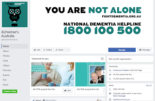
Similarly, with their Facebook page they have used a positive tone of voice and kept a consistent identity using the same two colours.
If I were to compare the effectiveness of both social media platforms, I would say that the Instagram account is a lot better suited due to the format and the fact that it is predominantly imagery which the campaign uses a lot.
This has informed my idea to utilise Instagram with my own campaign.


No comments:
Post a Comment