Tuesday 6 December 2016

Wireframing

Organising and mapping content


The point in this task was to visualise how the app will come together and how it will function. I wanted to inform as many aspect of the structure with the research I gathered early on in the process. Specifically, the aim is to also emulate the enjoyable and leisurely experience of physically going out and going into clothes stores on the high street.


Opening Screen


Taken from a couple of apps including the existing Hypebeast one, the app will start up with a black screen with the name centred in the middle. After experiencing it on previous apps, apps that open in this way immediately put the user at ease and engage them with the experience, this is similar to when one initially enters a shop on the high street.


A feature that has been added to this opening page is a friendly greeting message. This is informed by that fact that in clothes stores that offer a good shopping experience ask for their staff to greet customers as they walk through the door, further putting them at ease and making them smile. The greeting will change often so that the user notices it instead of ignoring it if they've seen it hundreds of times before.
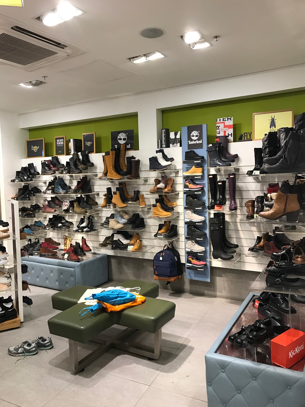


Landing Page


The landing page is incredibly simple with only a handful of navigation options to choose from. As this app is primarily for finding clothes to buy, the landing page consists of an endless list of items that the user may be interested in. The items are displayed so that the user gets a good idea of what the item looks like by using the entire width of the phone.


Below the top banner which includes the name Hypebeast, there is navigation bar that only has two options to keep it simple and easy to use. These two options are the 'Suggested page' shown here that appears when the app starts up, the other option is 'News Feed'. This is the social media feature that will be explained below.


If the user wants to quickly find out the sizes available for each item or find out which item fits them best, they simply tap the arrow at the bottom of each image. This will expose an opaque window that shows which sizes are in stock as well as it knowing which size would fit the user best. This window may also include quick links to the websites it is available from.


Item page


When tapped, the user is taken to a page that lets them flick through a number of pictures of that item from a few angles in order for them to get a better idea of the item. Below is the name and brand, underneath that is a large bar that simply says BUY. This is so that if a user wants to buy something, it is made very easy and obvious instead of looking around for where to buy it. Pressing it will take you to the recommended online store for purchase.


Below that is a brief description of the item including how it would fit the user; if its baggy, tight fitting etc.

Item page, Bottom half


The user can then scroll down the page for more info about the item. This section shows the user other items similar to the one they're looking at, allowing them to see other related items that they may not have seen otherwise. This section of the page will also tell the user who else has liked this item, the user can then click on the profiles of those users to then see what they have been looking at. The idea behind this is that being able to see what else other users of the same taste as you are looking at enables you to explore your tastes, labels etc more in depth.


News Feed

This is the secondary feature of the app and is a news feed very similar to Facebook that allows you to see what the people you're following have shared. This may include what your friends have discovered/bought or even what your favourite celebrities have been seen wearing or chosen to share. This will further enhance the user experience in showing them even more options for clothes. It also gives the user the opportunity to share what they have been looking at or even tag a friend in a post or share someone else's.

At first, the idea was for the app to share people's activity automatically however I saw this as problematic in terms of privacy. Some users may not want some of their app activity to be shared. To tackle this, the user will have to manually share something if they wish for it to be seen. This in fact makes the user more engaged within the news feed as apposed to someone doing it for them.

The idea to include a social media aspect was informed by the fact that a large majority of the most used smartphone apps are either predominantly social media based or include similar features including the most popular ones; Facebook, Instagram, Snapchat and Twitter. This feature allows for the user to make use of the app even if they don't want to buy anything and instead just want to read up about fashion related topics.


Profile Page

The second of two main navigations found on the bottom bar is the profile page. This is where the user can view and edit specific details about their account. The users profile includes a profile picture to allow other users to recognise them, and an account name. The box below will then include info such as Following (accounts that the user follows such as friends and celebs), Wishlist (similar to a music playlist, the user will be able to create as many lists as they like and add items they see to them to save them) and Likes (a list of all the items the user has liked in case they want to refer back to them).

There is also a mannequin icon in the top right which will be explained below.


Virtual Mannequin

This is another feature that separates this app from all other clothing apps. The virtual mannequin allows the user to edit it to be an exact replica of the users body shape and size. This can be done by pressing on each section of the body and inputting accurate information. This mannequin will then inform the app on a number of details with each item. For one, it allows the mannequin to highlight and show the user which size will fit them best with each individual item. Secondly, it will then explain how that item or size will fit their body, whether it will be loose, tight, short etc.


Music Feature

Informed by field research, the app will also include a music icon in the top left. When pressed, this will expose an opaque column that features all the music apps found on the users phone. The user can then click on which ever music app they wish. This will then show more options for the chosen app such as playlists, genres etc. The user can then click anywhere on the screen for it to disappear, allowing them to scroll through clothes whilst listening to their own music. A hidden feature that the user will be made aware of is that the navigation bar at the top can be swiped right to expose a music control panel including a pause, play and skip button.


Friday 2 December 2016

Design for Screen - Interim Crit

Feedback


Learning from the interim crit yesterday, I decided to write my questions and problem out on a large piece of orange paper hoping that it would grab the attention of people walking around. Thankfully, it worked and I ended up with a large amount of useful feedback that will inform my designs.

Notes:

Question 1 : Would use a recognisable name like Hypebeast make you more inclined to use it ?

- "I haven't heard of Hypebeast before but would make sense to enhance something with an existing following"
- "I think that Hypebeast is limiting your target audience to 13-25, Hypebeast is also a trend word which suggests that it could be out of fashion or uncool in a few years time" This is fine as that is my main target audience. 
- "of course, but this might limit your target audience to people who are only interested in street wear. So how can you make it more for everyone, but still using Hypebeast"
- "It definitely grabs the users attention however I agree with the temporary connotations that come with 'hype'
- "Yes, but it would also limit your design options as you have to be in keeping with guidelines" I don't see this as a bad thing as it will help the design keep consistent and have an image as opposed to creating something new that might appear muddled or inconsistent.
- "I think using a well established brand will make it more appealing, however you could consider adjusting logotype for specific feature.

Question 2 : The idea is to also create a 'News Feed' feature similar to FB where you can share clothes / see what other people are sharing... would you find this a useful feature when shopping online for clothes ?

- "It would be good to see what other people are wearing. This feature would be good for fashion bloggers"
- "Following celebrities like twitter would be a useful feature"
- "It would be interesting / useful - but maybe it doesn't have to be a 'News Feed' but people can upload outfit grids or wdywt's for people to share etc
- "Yes, I think the idea of sharing is a great idea to give inspiration. maybe have this in a separate page of the website"
- "Maybe be celebrities but I wouldn't want my friends to buy the same clothes as me" The user will have complete control over what is shared and so they can choose not to if they don;t want others to wear/buy it.
- "I think for people who are really into their fashion this would be useful to wee what other people are wearing/buying"


Question 3
 : How else would you simplify and make online shopping more enjoyable ?

- "produce search results tailored to individuals, as opposed to 1000's of results that overwhelm user"
- " Lots of filters to limit the amount of clothes to search through"
- "make it have not so many steps and have a better range of categories to help you find what you are looking for"

Analysing the feedback session

Successful methods for gathering feedback, methods I came across that made me more inclined to engage and give good feedback:

- direct, specific questions that are easily answerable despite the concept
- questions that make you think about your own experiences work well as everyone interacts with interfaces on a daily basis and so we all have a lot to say. The opinions will also differ from person to person giving varied feedback as opposed to a question that will receive similar feedback.
- Clearly laid out process with a number of visual examples to give the viewer a good sense of where the project is going. As creatives, we are also drawn to visual aid more than text.
- Position your work in a clear, empty space so that it's not lost amongst all other projects
- Have a range of different medias for the viewer to look at to keep them interested
- Use coloured paper to attract people to come and write on it

Useful comments to inform my process:

- "Maybe with celebrities but wouldn't want my friends to buy same clothes as friends"
I'll be considering this when designing the news feed so that users have full control over what is shared. 

- "produce search results tailored to individuals"
The search bar feature will only search things that the app has already found for them, it will allow the user to access it all quickly and easily.

Wednesday 30 November 2016

Site Maps

Organising Content

Deciding on the hierarchy of information.
- what I want the user to see first
- Whats the most important info-
- How can this be displayed in the right order

To do this, site mapping is a popular technique. This involves drawing up a diagram that represents the layers or pages of info that will be found within an app or website.


Final Site Map

Below is the order in which the info will be accessed, starting with a home page. The larger the boxes in the diagram, the more important the info is.


Simplified Site Map

The idea v=behind my concept is to make online clothes shopping less time consuming and overwhelming. To do this, I have stripped back an existing app and have not included anything that doesn't help the user find clothes they like. Some features already existing on the Hypebeast app include a video page and a categories page which are completely useless if I am using the app to buy clothes. If I want to watch videos I will refer to other apps on my smartphone, it is pointless to have them in the same place. The simplified sitemap below shows how simple and stripped back the structure of the app is. Being simple means that the user will not get lost within a number of different pages and functions and instead be able to navigate around stress free.


Design for Screen - Hypebeast

Redesigning and adding to Hypebeast

The decision to redesign the app and website for an existing website is informed by the fact that it will be instantly recognised and be familiar to a majority of the target audience. Hypebeast is a fashion and lifestyle blog that has been around for a while now and is highly recognised by a lot of people within my target audience. Using an existing website also means I can use their logo and identity, saving me the task of designing the whole thing.

I wont be redesigning the whole website, I will just be adding in features and taking some away to form my concept accurately. I will be doing the same to the existing smartphone app.

below is the opening homepage. The user is greeted with the latest articles that are aimed at any user, what I aim to do is make this opening home page personal and unique to the user, similar to the Facebook live feed page.


This is the bar of tabs running along the top of the page, each representing a feature of the website. I will be redesigning this to include the most important features of my concept. This will include a 'live feed' tab and a 'suggested just for you tab'. I will be removing all other tabs that aren't fashion related to further make the experience simple and easy. The suggested tab will show clothes that the user will like, currently Hypebeast doesn't show individual clothing items and instead just shows articles and blog posts.

These are the tabs that appear when the user clicks on the fashion tab from the home page. I will be redesigning this to be personal to the user and show up with brands they have previously looked at, liked etc.

Making these tabs relevant to the user makes for a much more unique and personal experience and stops any unwanted content appearing on the site.

Smartphone app


The opening screen will stay the same as this, I think that the simplicity of it works really well in looking elegant and well designed. Good type and typesetting consideration appeals to creatives.
The landing page will also stay similar in terms of layout. The simplicity of two tabs makes the user experience really relaxing and easy, something I wish to convey through my own concept. However the default tab that opens will be suggested clothes for the user to buy or browse. All the clothes that are shown will only be labels they've shown to be fond of or trends, subcultures, colours etc. The second tab will be the live feed where the user can see what friends and idols have been looking at, sharing, liking, disliking etc.

My app will feature other tabs such as this video tab shown on the left. However, this again will be personalised by the user. 

Tuesday 29 November 2016

Field Research

Looking into a Real Shoppers Experience

To inform my future design decisions, I went into town to document the user experience of a real life shopper visiting actual shops.

Shopping experience & what I wanted to find out and document:

- Identify what makes shops and shopping enjoyable
- Document the full shoppers experience
  > walking around finding shops
  > entering a shop
  > looking around and potentially buying

- Document this process in clothes shops suited to target audience

- Customer Service
  > is it useful/annoying etc
  > do they work

- Deals / offers ?
  > do they work
  > do they draw you in

 CHIMP 

Chimp is a skater brand clothes shop found in one of the shopping arcades in town. 

Experience :

- Blackboard outside advertising 25% off
- on entering, a bell rings to notify shop keeper of my arrival 
  > he then asks how I'm doing
- Shop layout is one constant circle
- Music playing around the store - music relevant and suited to target audience (younger / skater) etc
- warm, welcoming, clean smelling room
- Displays make for a stress free experience
  > displayed in a way so nothing is hidden behind anything
- changing room at the back, well lit up


Overall experience was relaxed and easy to find clothes of interest. The display techniques meant I could flick through the items easily without much effort, making me want to look more.


SCHUH


- Confronted with messy / cluttered array of shoes 
- difficult to know where to find the men's shoes
- music suited to a wider audience as products are too (UK top 40)
- found an interface on a wall, was too scared to use it due to the intimidating / unfriendly design
- wasn't greeted or asked how I was

- I didn't know if this was meant for customers or staff, but either way I didn't want to attempt to use it due to its unfriendly and intimidating interface.

Louis Vitton

As well as shops aimed at my target audience, I thought I would experience a high end shop to compare and contrast.

- Walked in to be greeted by shop attendant asking how I was
- No music playing, can hear voices of sellers helping customers
- Displays are very minimal, lighting helps make them look luxurious 
  > along with materials and textures used for shelving
- Higher ratio of shop keeper to customers, all smartly dressed
- The price displayed differently - small tiles in front of or behind each item

Harvey Nichols 


- Very busy, exciting, buzzy
- lots going on in a good, controlled way
  > music (festive)
  > plenty of staff there to help
  > security
  > nice smells
  > smiley staff
- the more expensive items are usually displayed more on their own to stand out and attract buyers
- classy Christmas decorations
- some displays are unnecessarily embellished like a piece of art


- brand name displayed in bold vinyl stickers on blank walls
- each logotype uses the brand typeface
- the simplicity makes for a luxury display that you wouldn't see in standard shops
- showing off the size of the store

App features informed by research

Music

- clothes shops almost always have background music playing
- the music often relates / is suited to the target audience
e.g. CHIMP - playing hip-hop / rap to match with sub culture
       Shuh - plays pop music as their target audience is broader
       LV - no music playing
- music tends to play quieter the more high end the shop is

Informed app feature

- different genres of music plays out of smart phone / earphones depending on what you're looking at
- possibly pair up with spotify / Apple music
- paired with spotify, the app will find music in your library to play that is matched with the department / label / gender etc that the user is looking at
- this would further personalise the app.

Questionnaire


Design For Screen - The Process

A breakdown of the Process

- Really Start to think of the user experience
  > have this in the centre
  > emotion / passion / experience etc can enhance the message you wish to communicate

- Identify problematic / negative experiences
  > have this inform the design

- For web design, research can include...
> page impressions - a request to load a single page of an internet site (the number of visits to that page)
> Unique users - the number of individual users to a site over a defined period, often a month
> User flows - a diagram showing a user's journey, used to show most likely user experience
> Personas - fictitious characters that are created to represent user types
> Use cases - a description of a system's behaviour as it responds to a request

- One-on-One - person to person interviews with specific questions asked by the interviewer to gain a specific understanding of their behaviour/thoughts associated with a service or product

- Focus Groups - a form of qualitative research, a group asked thoughts on a product, service or concept

- SWOT analysis 

- Questionnaires 

- Marketing Segmentation - groups of people or organisation sharing one or more characteristic that causes similar product needs

Gather info from as many of these techniques as possible, this data will then inform each design decision made.

Identify WHO

Every user interface should be designed for a specific target audience

Individuals:

what is the age range ? 13 - 34 year olds
will your interface appeal more to men or women ? typically, fashion apps and websites are predominantly aimed at females, however there has definitely been a growth in men's fashion online and so the market for both genders is worth targeting.
is your interface specific to a country ? To start with, the app will be specific to the UK as the availability and postage of clothes in other countries could need come consideration.
is the target audience based in urban or rural areas ? statistically, people who live in major cities are more likely to be fashion conscious which would mean this app and website would be aimed at them. As well as this however, the app will also target people who don't live close to high street shops and brands. The app would be a way for them to stay in touch with the industry without making the journey to the nearest town or city.
what is the average income of the target audience ? Younger audiences tend to have lower incomes, however students these days are given quite a bit of disposable income and are very likely to spend a bit of this on clothes.
what is their occupation ? school students, college & uni students and people with their first / second jobs.
what devices do they use ? smartphones, tablets and laptops

Invent some fictional visitors from your typical target audience...

Then Identify WHY

Why are/would the users visit your interface. what is the specific reason the target audience would engage with your interface

Motivation:

Are the users looking for general information or do they need something to achieve a specific goal ? A specific goal to find out about and possibly buy new clothes
If there is a specific goal is it personal or professional ? A purely personal, leisurely goal
Is spending time on the interface seen as essential or a luxury ? a luxury experience that is only used when the user has some free time. should not be used in say a work place or when driving.

Goals:

Do they want general information / research or are they after something specific such as a fact or product ? the users are looking specifically for fashion content; clothes to buy, release dates, shop updates, stock alerts etc

Are they familiar with the service or product or do they need to be introduced to it ? As I am designing the app for an existing website, the user will be familiar with the name, industry etc however there will be a few features that will need to be introduced to the user when they first use it. A tutorial will be put in place to help.

Are they looking for time sensitive information, such as news or updates on a topic ? users will want to be shown whats newly released, up to date, stuff they haven't seen before and might not have without the app.

And lastly WHAT

What information do the users need and in what order to achieve their goals quickly and effectively ? The users will primarily want the app to suggest clothes to buy, favourite label releases and inspiration. After this, the user will then want to make use of other features such as what their friends, idols etc are wearing / sharing.

Will users be familiar with the subject or brand or do they need to be introduced to it ? The app will work with an existing fashion and lifestyle blog/magazine/website so the user will already be familiar with the name. The user will just be introduced to the features of the app.

What are the most important features of the service ? finding new/unseen fashion items that would interest the user based on their likes and dislikes. The secondary function is the social media side of things, seeing what people are sharing / wearing etc.

What is special about what this offers that differentiates it from competitors ? The app knows almost everything there is to know about you, your likes and dislikes, your favourite labels, idols, physical stature, any sub cultures. It is also paired with the users selected music library to give each user a personal experience. It also lets you see what your friends and idols are wearing and sharing. The app will also have a built in voice (like siri) emulating a show keeper you'd would get in a real shop, this voice would welcome you into the app and then try to help you with any query or question.

How often will people engage with your interface ? The aim is for the app to have enough features and uses that the user will want to use it on a daily basis. Social media apps such as Facebook, Instagram and snapchat are used on a daily basis, multiple times. The social media aspect of this app will give the user enough to engage with to use just as often. What will make the user engage with it more often is the fact that the more they use it, the more the app learns about them and their fashion interests.

Solution

The results from the Idea Phase, along with the brief and the research data, are compiled to create a clear design direction...

Lo Fi
- This could be a sketch of the page-types, wireframes, or an HTML prototype.
- The point is to get something sketched out, in as complete a state as possible, and begin to solve those problems as they arise
- Do it quickly and cheaply

Test and Iterate
- Testing can be done formally or with colleagues, friends or family
- The point is to get a real person using the product

Design Comps
- Design visuals are in this phase
- They focus on elements such as brand, colour & typography
- They must all coincide with the informed functions and features