Thursday 29 October 2015

Revolutions


BRAVERY

My word for my typeface design is 'Brave'.

After brainstorming into the word, coming up with all types and examples of bravery, I came up with the idea to explore Revolutions and their propaganda.

The first revolution I have looked into is the Russian Revolution of 1917.


The text used in all propaganda posters and images is always bold and hard hitting in order to grab the attention of the desired audience. From this I will manipulate my own typeface to fit this exact purpose. I will make sure that my typeface works best on posters and as headers as apposed to one used for bodies of text.

To do this I will produce my typeface in capital letters and make it bold and attention grabbing. I wil manipulate the kerning and tracking so that the typeface is easily read from a distance as well as being clear and legible.

Tuesday 27 October 2015

Colour Relativity


Colour Relativity


In response to our lecture on colour theory, We have been instructed to pick our least favourite colour. I picked a light green ( Pantone 3405 C) for the simple reason of I'd never wear it as clothing. We then have to pick another Pantone colour that will contrast it in any way, it could either dull the original colour down, match it's brightness or cancel it out completely.


I've decided to match my least favourite colour with Pantone 570 C. This is quite a strong turquoise colour that helps to soften the green next to it. Together they result in a successful colour way for a children's book cover as they stand out on a shelf and would be eye catching to a younger audience.

When I matched these two colours, I realised they looked similar to colours used for dinosaurs in the cartoons I watched as a young boy.


This is the book cover I produced, using the colours I looked at previously. I was instructed to implement Black into the design so I used it for the text. I think it works well for a children's novel as it's easy to the eye and makes for a friendly looking dinosaur.


Colour Theory - Part 2


Subjective Colour

Dimensions of Colour


  • Contrast of TONE
  • Contrast of HUE
  • Contrast of SATURATION
  • Contrast of EXTENSION
  • Contrast of TEMPERATURE
  • COMPLIMENTARY contrast
  • SIMULTANEOUS contrast
While we have focussed on chromatic scales, we should also consider monochrome scales


Contrast is a lot more problematic with colour...


Contrast of Hue:

Formed by the juxtaposing of different hues. The greater the distance between hues on a colour wheel, the greater the contrast


This use of contrast would be suitable for children's book illustrations or posters at school as the colours are very easy to distinguish even when out next to each other. They are also attention grabbing.


these contrasting colours are also effective in branding and logo, specifically for fast food joints. The colours are eye catching and memorable.


Contrast of saturation:

Formed by the juxtaposition of light and dark values and their relative saturation


Using different amounts of saturation is one of my favourite methods of using colour. It is easily adaptable and can be used for a number of different projects. 


Contrast of extension:


Formed by assigning proportional field sizes in relation to the visual weight of a colour. Also known as the contrast of proportion


Contrast of temperature:

Formed by Juxtaposing hues that can be considered 'warm' and 'cool'. Also known as contrast of warm and cool


Complementary contrast:

Formed by juxtaposing complementary colours from a colour wheel or perceptual opposites


examples of juxtaposing colours on a colour wheel being used are found on football jerseys all over the world. These kits use bright colours and their contrasting counterpart. Normally this would not be featured on an item of clothing but it works on football shirts as it is exciting and full of energy, as is the sport itself.


Simultaneous contrast:

Formed when boundaries between colours perceptually vibrate


Monday 26 October 2015

Drawing the Detectives


Agatha Christie's 125th Birthday


In tribute of Agatha Christie, We have been set the task of redesigning a book cover for one of her many famous novels. 

Agatha Christie is one of the most highly credited novelists ever to live who produced a  hugely extensive collection of novels, most of them being detective novels and short stories.

I was given a novel called 'The Secret Adversary'.

The Secret Adversary is a detective novel and is Christie's second novel ever to be published. The book introduces the characters of Tommy and Tuppence who feature in 3 other of her books. The story follows these two characters in starting up a business they call 'The Young Adventurers Ltd' with a slogan reading 'Willing to do anything, go anywhere'. The storyline is based around a woman named Jane Finn and more importantly, a treaty agreement she had with her when she disappeared. Tommy and Tuppence are given the task of finding this woman and preventing the treaty falling into the wrong hands.


The original book cover features a creepy looking man wearing a suit revealing a bear's head underneath a mask. As with all other Agatha Christie novels, there is a huge variety of alternative book covers (shown on the left).


I am hugely fond of the original book cover due to it's ambiguity and colours used. The colour pallet is typical of the early to mid 20th century as well as the hand drawn illustration. The alternative book covers shown above were designed a lot later on and in my opinion have more relevance to the storyline and therefore are more effective. However I think the original is still a lot more aesthetically pleasing and suited to the genre and era of when it was written.

I aim to produce a more modern take on the cover. I will be exploring the use of colour and type and will be looking to simplify the cover into maybe one or two colours and one or two shapes. The end result should hopefully communicate the story line or an aspect of it as well as looking slick and simple.

I have explored a number of other detective novels written around the same time and looked into their book covers. They range from simplistic to artistic and use a whole range of colours. The more illustrative ones use more subtle, soft colours and create more expressive imagery. Whereas others use a more modern approach using only a few shapes and colours incorporated with the text.


I have read through a number of storyline summaries and have had some ideas on what shapes to include. As the story line is based on a missing treaty, I had ideas to include objects and symbols associated with this.


For my first idea, I decided to use an image of a hand written treaty. The colours chosen are typical of the time the book was written (early 20th century). The hand rendered image can be associated with early illustrations before things were done on computers. I then matched the header and footer colour to the image. I used Bell MT Bold for the font as I think it works well along side the type within the image. 

The blocks of colour behind the text are there as a template or grid. This morning we were shown some examples of book covers by Penguin Books. They have used a template for all their books throughout the years. This template is simply two blocks of colour at the top and bottom with the title written in between. I have slightly replicated this and used the blocks of colour to frame the text


For my second idea, i used a quill and ink. I decided to use this image as when this novel was written, there would have still been a lot of use for quill and ink instead of print. I like the ambiguity of the relevance of the image to the plot of the novel as it would not be obvious straight away. I used Black and Yellow as this commonly signifies danger. Danger is a common theme throughout the novel. I used fonts that look slightly hand-rendered to fit in with the image as well as the genre of novel.

The amended image works a lot better with the surface at the bottom being filled in with black. It makes the text at the bottom a lot more readable as well as giving the cover a composition.


My third idea is a lot more simple than the previous two. I have decided to make it monochrome and used a very simple typeface of Gill Sans. The image is relevant to the plot in that a treaty is similar to an agreement, therefor the shaking hands portrays this. The dark red, I feel, works well with the genre of book as its quite dark and dangerous. The text reading "Agatha Christie" is very recognisable and would stand out on a shelf of books.

Although we only had a day to work on this project, it has made me realise how easy it is to come up with a number of ideas after only a small amount of research. I am extremely fond of the book covers I came across during my research. My favourite style are the illustrated, hand-rendered imagery with a hand-rendered text on top. This gives the novel a really bespoke, collectable feel to it.


Friday 23 October 2015

Summative Evaluation for Studio Brief 01


Today's Feedback Friday started with a summative critique session in the studio. We we're split into two groups, group 1 left their work in the studio whilst group 2 stayed and evaluated it. We each produced 5 questions of our own that we would like to be answered during the evaluation.

  Walking around the room, looking at everyone's work, I started to make evaluations of my own and wrote them down next to the work. At first I found it quite difficult to form any evaluation and simply answered the questions presented to me. As the session went on and as I started to see more and more people's work, I began to gather much more of an idea of what and how to say it. 

  I began to compare some peoples work to others, as well as comparing the way in which they have presented their work and whether this had any affect on the ease of evaluating the work.

  Some projects were a lot easier to evaluate than others. This was due to a number of reasons...

- the main way it was made easier was the choice of questions left by the designer. If the questions made you think and asked for a reason why or an explanation of your opinion, it forced me to produce a lot more substantial feedback that would be more useful to them in their evaluation.

- presentation techniques also helped aid the feedback. Providing some text as so why changes were made as well as plenty of imagery demonstrating development and reasoning behind it

- I didn't receive as much feedback as some and I think this is due to where I set up my work. unfortunately my work was situated in the back corner of the room and because of this I think that people were less inclined to approach my work. In the future I will make more of an effort to get my work more central so that I gather more useful feedback.

Tuesday 20 October 2015

Colour Theory


Ambiguity can be both positive and negative.

  Positivity in design being ambiguous is that the work is open to interpretation by the viewer. This allows people to connect with the work in a personal way and take from it what ever they please.

  We were shown a music video that exploited the power colour has on our eyes and how our perception of colour can be played with using absence of colour.

  Our eyes have the ability to compensate for strong colours by seeing opposite colours when our eyes are resting.


  Colour combinations can affect readability and accessibility. For example, a lot of signage uses the combination of Black & Yellow. These colour are proven to work well together in enabling the viewer to read the info displayed clearly from a distance. Whereas the combination of Green and Red is proven to be hard to read and distinguish therefor is rarely used in design.


Receptors


The diagram above shows the sequence of how humans perceive colour.

Rods - This perceives Black & White

Cones - Perceive colour

- There are 3 types of cones that each perceive a different primary colour

- These cones then work together to allow us to see all colours of the spectrum as each of the cones will see differentiating amounts of the colour they perceive.

Halftone printing


This diagram explain how colours are printed. All colours are a combination of other colours. What determines the colour is the intensity of each colour involved.


Studio Task.

In groups of 4 we have been asked to pick two film genres and explore the pantone colour range. We then have to pick two pantone shades that we think:


a) represents a typical cover colour choice

b) a less conformist yet still interesting opinion


Our first genre choice is Fairy Tail.


  Fairy tales are known for being bright, happy and colourful. Most animated fairy tail stories involve a range of pinks, blues, yellows and greens. These colours are easy to read and make for a generally positive, mystical image.

  Therefore we have chosen Pantone 'Pink 237 M' as our first choice. This colour is a saturated yet soft shade of pink commonly associated with princess dresses.


  Our second, less obvious choice is Pantone Blue/Green 317 M. This is light turquoise colour that we feel is closely related to the pink we chose. It is a soft, subtle colour that can be associated with an overwhelming blue sky or a princess dress.


Our second genre of choice is Science Fiction


  Science fiction is generally quite a masculine genre of films therefore the colours used for the set and costumes are usually dark blues, greens and blacks. 

  The first colour we chose as a typical cover colour is Pantone Blue 2955 M. This blue we thought is associated with the dark sky and space. It is generally a masculine colour and is intense and ominous.


  The second colour is Pantone Grey 414 M. This colour can be recognised as the colour of martial and other walks of life. It is also quite mechanical and metallic, resembles spaceships and UFOs.


Monday 19 October 2015

Logotype


Rebranding: Lush 

I've decided to undertake a rebranding project for Lush, a cosmetic store founded in the UK. Lush pride themselves on being an eco friendly company that refuse to test their products on animals and source their ingredients responsibly and organically. Their window and store displays are very organic looking with the use of hay, wooden furniture and pastel colours. 

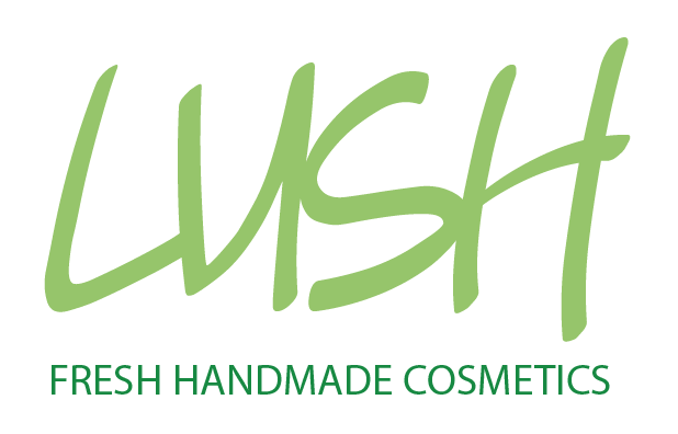
  The main reason I chose Lush is because, in my opinion, their logo completely contradicts everything they stand for and doesn't communicate anything about the company.
  Above is an image of the current logo and slogan. It's simply bold, white Helvetica bold on top of a black background. To me, this is a poor representation of the company and how they operate. The words 'FRESH' and 'HANDMADE', to me, should not be written in bold, black and white letters and instead should have a more hand-rendered font, potentially added colour too.


 My primary researched involved going to visit the Lush store in the town centre. I went in and took note of all the sights, sounds and smells. One thing that hit me most when i got there was the overwhelming smells of bath bombs and floral soaps. All the displays were on wooden furnishings and had chalk boards above. The chalk boards were filled with the bespoke Lush typeface that they designed. Immediately, I thought that the typeface used on the chalk boards made a much better effort at representing the company as a whole.  

  I then found the font they use on their displays and downloaded it so that i could use it and manipulate it into a new logo.


  Here I've used the font I downloaded and combined it with the current colour way and structure of the logo, using white text on black background. I further combined this with the company slogan. Already, I feel as though the logo above is a better representation of the company as the font used has a hand-rendered look and is more free flowing which denotes their organic resources.


  Some examples of hand rendered work. I began by carefully hand drafting the logos i wish to carry forward. To develop on them, I then used layout paper to trace and manipulate the text. I've also included a sketch of the logo being put into practice on a Lush product.

  I decided to produce a lot of hand rendered work for this specific topic as I felt it was an apt approach to the rebranding of Lush due to their handmade, organic image they try and promote.


Using my logo in places it would be found, shop front and on products. Initial impression was that it worked well however when I put it to a group of fellow students the main feedback was that there is a lack of colour.


Having received feedback, I returned to the drawing board and decided to play around with colours. The colours I chose were based on the colours found in their shop displays. All of their products have a soft, pastel colour such as pink or yellow or green. The other reason I decided to use green was that I feel it portrayed their eco-friendly image.


After a second critique, I learnt that in order for a brand to come alive, it has to be given a place or atmosphere. I got the idea to put the text onto wood as many of the shop displays are situated on wooden furnishings. I think that it gives a very organic feel to the logo and ties in well with the aesthetics of the shop displays.


After making a decision on the font, spacing and other aspects of the letterforms, I then decided to explore adding a frame or shapes to the logo. I took inspiration from one of Lush's previous logos. The previous logo was made up of two oblong shapes of yellow and green, one inside the other, with bold white text on top. I recreated this using my lettering and more suitable colours. 
I then took this forward by changing the oblong shapes to circles. The circle logo would work well as a logo or symbol and works on a number of scales and platforms. It is easily recognisable and can be distinguished from afar.

 Final 4 ideas

Top Left: Logo or symbol using suitable colours and incorporating the text in white. Final result being a refreshing and easy to distinguish logo that can be easily adapted and used on every scale.

Top Right: White text on top of wooden background. Inspiration for use of light wood came from the shop displays I saw when I visited the store. Again, this makes for an organic look and in touch with nature. 

Bottom Left: Text in a soft green with the slogan underneath in a slightly darker shade to distinguish it from the logo. Aims to look eco-friendly and good to the earth

Bottom Left: Helvetica font for main logo and hand-rendered typeface for the slogan. At first I used the hand-rendered font for both but after gaining feedback, the general consensus was that there was too much of the font used in both the logo and shop displays. 


 I have decided that the logo above is my favourite and that I will carry forward. I've chosen this one because I feel, as well as people I've shown, that it is the most successful at communicating the company's image of being organic and green. The word 'Lush' in the hand-rendered font makes for a more 'handmade' feel, a word included in their slogan. The logo also looks fresh and healthy which is desirable of a cosmetics store.

My Logo printed onto a pot of body lotion. It stands out well with the use of colour.