Monday 30 April 2018

OUGD603 - EP - Exhibition - Time Plan

Keeping the Team
Organised

Through the majority of the process, I was in charge of keeping an up-to-date time plan that allowed us to make sure we were equally distributing the work load. Each time we met up or other progress was made, I documented it in the plan. This also helped us gage how long we spent doing each stage of the process. Sometimes we would look at the time plan and realise that we needed to pick up speed as the rate we were going was too slow and the show date was creeping up on us.

Time Plan from February through to mid April:

Sunday 29 April 2018

OUGD603 - EP - Exhibition - Show Night

A Night of
Success 

After having spent all day preparing the venue with posters, lighting, plants and a DJ booth, it was finally time for guests to start arriving. There was a constant flow of people all evening, with it getting very busy at times. There was live music from a few DJs that came up from London, as well as a selection of free drinks. 

The end result was very rewarding and is something I aim to do a lot more of in the future. I learned a lot from the process from the start all the way up to the event night and has been one of my most enjoyable projects to date.

Below are a selection of photos taken that night:


OUGD603 - EP - Research Led - Impossible Foods

Researching Existing
Sustainability Solutions

Impossible Foods


- impossible food is a company working to transform the global food system by inventing better ways to make the food we love
- they are a fast-growing start up with a mission to make the global food system more sustainable
- they employ scientists, engineers, food developers and business professionals


Huel


- taking a slightly more unconventional route, Huel is a nutritionally complete powdered food that contains all the daily proteins, carbs and fats a person needs
- with their primary focus being to make a nutritionally complete and affordable product, their aim is to also contribute to the environmental impact of the food industry.

Evaluation
- despite the disappointing discovery of organisations completely ignoring the crisis, there are also a large number of companies and researchers that are working tirelessly to make a difference in an attempt to change people's diets.

Wednesday 25 April 2018

OUGD603 - EP - Exhibition - Vinyl

Vinyl Sticker on
Wood for Exhibition

On the train from Leeds to London, on the way to an open day, I was brainstorming ideas on how we can decorate the venue to strengthen the branding and identity so that it is clear and distinct. I wanted to produced something on a large scale but that was time efficient. I only had three days left until the event night which was just enough time to produce the vinyl.

I purchased the piece of wood from downstairs at uni for the reasonable price of £4.80. The vinyl was printed and cut in the digital print room. It was printed as one long black sticker, I had to then apply the sticker to the wood to then peal away any unwanted material. This was a very long and painful process but the result made it definitely worth it.

The unintentional second benefit of producing this was that, as I left it in the studio for a couple of days before transporting it to the venue, it caught a lot of attention from people using the studio space. The vinyl then acted as another piece of promotional material and ended up being one of the most successful.


OUGD603 - EP - Exhibition - Range of Ideas / Poster Development

Interpreting 
Brotherton House

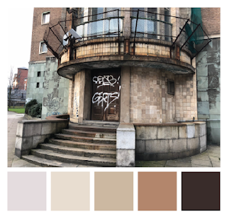
Colour Schemes
taken from my photos of the building as a starting point to informing the graphic interpretation.


Technical Line drawings inspired by architectural drawings, focusing on the shape and structure.


As Brotherton House is a former police HQ, I decided to draw up a 1950s police car in the same style. This may be used later on to inform viewers of the purpose of the building without spelling it out.


Developing on from the line drawings, and inspired by research into Bauhaus and Constructivism posters, images of the builidng was traced over and represented by outlines of shapes. The compilation of shapes aim to show the form and structure of the building without including every detail.

Colours taken from the tiling of the building were then added to the blocks to achieve a 3D effect, showing the shadows and reflections made by different elements of the building.


Next was adding colour, informed by the previous colour grabbing from the buildings tiles.

To then give the drawing some depth, I used the different shades of blue to demonstrate shade and light.


The end result represented the architectural structure well and each element was well informed, however when considering that these prints will be posters, the next stage was to turn the shapes into a a layout or composition as opposed to a floating graphic.

Other Experiments:

Inspired by the many windows covering the larger faces of the building, the drawings and patterns below were created. Feedback suggested that they were slightly too abstract however, and I should keep the drawings more realist.


Final Designs once they have been framed, ready for the exhibition:


Friday 20 April 2018

OUGD603 - EP - Research Led - Discussion & Feedback

Pitching my
Research and Development

-Consider target audience
  - families, home diets
  - target families to try to change children's eating habits
  - focus more on changing the minds of younger generations as older are harder to convince
  - younger generations are more likely to get on board with 'future' topics

- Bring product into audience's lifestyle
  - create a lifestyle brand
  - based on previous research into lifestyle branding, storytelling.
  - create brand/lifestyle that people want to be a part of
  - using typical lifestyle branding techniques
  - in order to get people to WANT to change as opposed to need
  - create a group that people want to be part of
  - in the form of a magazine?

- MOLD magazine - research

- Don't advertise as 'future' food.
  - bring it into the now
  - something that is happening and people should be on board with it

- 'Monthly Feast' - event themed with future of food
- Get people to try the foods, get familiar with them, make them less alien and prove that its a good substitute
- Make easy, less intimidating
- Association is to go fully veggy as opposed to partly

MOLD Magazine

"MOLD is an editorial platform about designing the future of food. Through in-depth, original reporting and a distinct vision for how design can transform our food futures, our editors cover innovative ideas emerging from the world of food design and technology. From cellular agriculture to 3D food printing, entomophagy to beautifully designed tableware (and why it makes your meal taste better), MOLD spotlights the ideas that will revolutionise how we produce, prepare and eat food in the years to come."


Belgrave Feast


OUGD603 - EP - Eatery - Final Resolution

Photography of
Final Outcomes

For the shoot, we decided to set up a replica of what the outcomes might look like when set out in a restaurant setting. This included chopsticks, dishes, condiments and even sushi.

We were pleased with the final outcome however there was one limitation. When we sent the items to be printed, the blue colour didn't come out as vibrant as intended, this made them menu etc look slightly muted. We were able to edited to colours after the images were taken, but it would have been a more successful outcome had the colours have printed as intended.


The menu was designed with a perforated slip down the right hand side of the menu. This was informed by research and previous experiences of Japanese restaurants and the methods they use to take orders. Each item on the menu is numbered, the customer draws an 'x' next to each item they want to order. The slip is then torn off of the menu and given to the waitress. One benefit of this method is that it relinquishes any chance of miscommunication between staff and customers. 

Informed by this method and the fact that each menu can only be used once, it is printed on a cheap stock so that they can be mass produced.


Other collateral produced included a chopstick sleeve and discount flyers. The flyer was informed by the fact that one intention of the rebrand was to attract a wider, more diverse audience and this included students. As Leeds is full of thousands of students who are known for spending money on food and eating out, it made sense to aim the flyers at them in order to entice them.


Wednesday 18 April 2018

OUGD603 - EP - Eatery - Digital

Website Design for
Smart Phone and Laptop

To digitalise the rebrand, we decided to mock up how the website would look on a smart phone and laptop. The site has a consistent off white back ground, to match the the printed outcomes and brand colours.

The existing restaurant doesn't have a website and gives wrong information when searched in Google. The new website allows users to book a table, see the menu and contact the restaurant for any enquiries.


OUGD603 - EP - Eatery - Screen Print

Screen Printing a
Door Way Hanging (Noren)

One of the outcomes we decided to produce for the restaurant rebrand, informed by research on the existing interiors, is a door way hang or otherwise known as a Japanese Noren.

The existing norens in the restaurant were authentic, however they would not comply with our branding guidelines and so a redesign would be necessary.

Existing hangings


My designs


 Feedback suggested that the noren should be more decorative and does not need to feature the restaurant name and logo in large. Informed by this, the final design was this:


Production

The background colour we decided on to be carried through the branding is an off white/ light brown colour. This informed my search for fabric. I went to the market in town where there is a stall selling all sorts of materials and chose an fabric that would be appropriate for textile screen printing. I has to make sure that the fabric would take the ink well and not bleed so that the design stayed crisp and clear.

Mixing the colours, I made sure to get them as close to our guidelines as possible. Performing a screen print allowed me to get the colours as bright as they appear on screen. 

I am not overly confident at screen printing, however I managed to get two good prints that we can photograph and submit.


Next, we need to trim down the material and stitch hems onto each side and a hoop on the top edge that allows us to hang from a doorway.