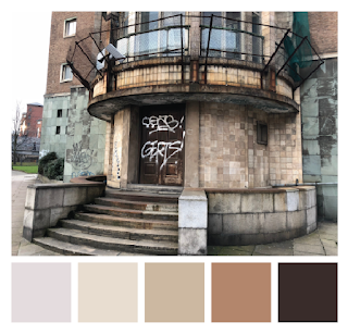
Brotherton House
Colour Schemes
taken from my photos of the building as a starting point to informing the graphic interpretation.
Technical Line drawings inspired by architectural drawings, focusing on the shape and structure.
As Brotherton House is a former police HQ, I decided to draw up a 1950s police car in the same style. This may be used later on to inform viewers of the purpose of the building without spelling it out.
Developing on from the line drawings, and inspired by research into Bauhaus and Constructivism posters, images of the builidng was traced over and represented by outlines of shapes. The compilation of shapes aim to show the form and structure of the building without including every detail.
Colours taken from the tiling of the building were then added to the blocks to achieve a 3D effect, showing the shadows and reflections made by different elements of the building.
Next was adding colour, informed by the previous colour grabbing from the buildings tiles.
To then give the drawing some depth, I used the different shades of blue to demonstrate shade and light.
The end result represented the architectural structure well and each element was well informed, however when considering that these prints will be posters, the next stage was to turn the shapes into a a layout or composition as opposed to a floating graphic.
Other Experiments:
Inspired by the many windows covering the larger faces of the building, the drawings and patterns below were created. Feedback suggested that they were slightly too abstract however, and I should keep the drawings more realist.
Other Experiments:
Inspired by the many windows covering the larger faces of the building, the drawings and patterns below were created. Feedback suggested that they were slightly too abstract however, and I should keep the drawings more realist.
Final Designs once they have been framed, ready for the exhibition:


No comments:
Post a Comment