Wednesday 30 November 2016

Site Maps

Organising Content

Deciding on the hierarchy of information.
- what I want the user to see first
- Whats the most important info-
- How can this be displayed in the right order

To do this, site mapping is a popular technique. This involves drawing up a diagram that represents the layers or pages of info that will be found within an app or website.


Final Site Map

Below is the order in which the info will be accessed, starting with a home page. The larger the boxes in the diagram, the more important the info is.


Simplified Site Map

The idea v=behind my concept is to make online clothes shopping less time consuming and overwhelming. To do this, I have stripped back an existing app and have not included anything that doesn't help the user find clothes they like. Some features already existing on the Hypebeast app include a video page and a categories page which are completely useless if I am using the app to buy clothes. If I want to watch videos I will refer to other apps on my smartphone, it is pointless to have them in the same place. The simplified sitemap below shows how simple and stripped back the structure of the app is. Being simple means that the user will not get lost within a number of different pages and functions and instead be able to navigate around stress free.


Design for Screen - Hypebeast

Redesigning and adding to Hypebeast

The decision to redesign the app and website for an existing website is informed by the fact that it will be instantly recognised and be familiar to a majority of the target audience. Hypebeast is a fashion and lifestyle blog that has been around for a while now and is highly recognised by a lot of people within my target audience. Using an existing website also means I can use their logo and identity, saving me the task of designing the whole thing.

I wont be redesigning the whole website, I will just be adding in features and taking some away to form my concept accurately. I will be doing the same to the existing smartphone app.

below is the opening homepage. The user is greeted with the latest articles that are aimed at any user, what I aim to do is make this opening home page personal and unique to the user, similar to the Facebook live feed page.


This is the bar of tabs running along the top of the page, each representing a feature of the website. I will be redesigning this to include the most important features of my concept. This will include a 'live feed' tab and a 'suggested just for you tab'. I will be removing all other tabs that aren't fashion related to further make the experience simple and easy. The suggested tab will show clothes that the user will like, currently Hypebeast doesn't show individual clothing items and instead just shows articles and blog posts.

These are the tabs that appear when the user clicks on the fashion tab from the home page. I will be redesigning this to be personal to the user and show up with brands they have previously looked at, liked etc.

Making these tabs relevant to the user makes for a much more unique and personal experience and stops any unwanted content appearing on the site.

Smartphone app


The opening screen will stay the same as this, I think that the simplicity of it works really well in looking elegant and well designed. Good type and typesetting consideration appeals to creatives.
The landing page will also stay similar in terms of layout. The simplicity of two tabs makes the user experience really relaxing and easy, something I wish to convey through my own concept. However the default tab that opens will be suggested clothes for the user to buy or browse. All the clothes that are shown will only be labels they've shown to be fond of or trends, subcultures, colours etc. The second tab will be the live feed where the user can see what friends and idols have been looking at, sharing, liking, disliking etc.

My app will feature other tabs such as this video tab shown on the left. However, this again will be personalised by the user. 

Tuesday 29 November 2016

Field Research

Looking into a Real Shoppers Experience

To inform my future design decisions, I went into town to document the user experience of a real life shopper visiting actual shops.

Shopping experience & what I wanted to find out and document:

- Identify what makes shops and shopping enjoyable
- Document the full shoppers experience
  > walking around finding shops
  > entering a shop
  > looking around and potentially buying

- Document this process in clothes shops suited to target audience

- Customer Service
  > is it useful/annoying etc
  > do they work

- Deals / offers ?
  > do they work
  > do they draw you in

 CHIMP 

Chimp is a skater brand clothes shop found in one of the shopping arcades in town. 

Experience :

- Blackboard outside advertising 25% off
- on entering, a bell rings to notify shop keeper of my arrival 
  > he then asks how I'm doing
- Shop layout is one constant circle
- Music playing around the store - music relevant and suited to target audience (younger / skater) etc
- warm, welcoming, clean smelling room
- Displays make for a stress free experience
  > displayed in a way so nothing is hidden behind anything
- changing room at the back, well lit up


Overall experience was relaxed and easy to find clothes of interest. The display techniques meant I could flick through the items easily without much effort, making me want to look more.


SCHUH


- Confronted with messy / cluttered array of shoes 
- difficult to know where to find the men's shoes
- music suited to a wider audience as products are too (UK top 40)
- found an interface on a wall, was too scared to use it due to the intimidating / unfriendly design
- wasn't greeted or asked how I was

- I didn't know if this was meant for customers or staff, but either way I didn't want to attempt to use it due to its unfriendly and intimidating interface.

Louis Vitton

As well as shops aimed at my target audience, I thought I would experience a high end shop to compare and contrast.

- Walked in to be greeted by shop attendant asking how I was
- No music playing, can hear voices of sellers helping customers
- Displays are very minimal, lighting helps make them look luxurious 
  > along with materials and textures used for shelving
- Higher ratio of shop keeper to customers, all smartly dressed
- The price displayed differently - small tiles in front of or behind each item

Harvey Nichols 


- Very busy, exciting, buzzy
- lots going on in a good, controlled way
  > music (festive)
  > plenty of staff there to help
  > security
  > nice smells
  > smiley staff
- the more expensive items are usually displayed more on their own to stand out and attract buyers
- classy Christmas decorations
- some displays are unnecessarily embellished like a piece of art


- brand name displayed in bold vinyl stickers on blank walls
- each logotype uses the brand typeface
- the simplicity makes for a luxury display that you wouldn't see in standard shops
- showing off the size of the store

App features informed by research

Music

- clothes shops almost always have background music playing
- the music often relates / is suited to the target audience
e.g. CHIMP - playing hip-hop / rap to match with sub culture
       Shuh - plays pop music as their target audience is broader
       LV - no music playing
- music tends to play quieter the more high end the shop is

Informed app feature

- different genres of music plays out of smart phone / earphones depending on what you're looking at
- possibly pair up with spotify / Apple music
- paired with spotify, the app will find music in your library to play that is matched with the department / label / gender etc that the user is looking at
- this would further personalise the app.

Questionnaire


Design For Screen - The Process

A breakdown of the Process

- Really Start to think of the user experience
  > have this in the centre
  > emotion / passion / experience etc can enhance the message you wish to communicate

- Identify problematic / negative experiences
  > have this inform the design

- For web design, research can include...
> page impressions - a request to load a single page of an internet site (the number of visits to that page)
> Unique users - the number of individual users to a site over a defined period, often a month
> User flows - a diagram showing a user's journey, used to show most likely user experience
> Personas - fictitious characters that are created to represent user types
> Use cases - a description of a system's behaviour as it responds to a request

- One-on-One - person to person interviews with specific questions asked by the interviewer to gain a specific understanding of their behaviour/thoughts associated with a service or product

- Focus Groups - a form of qualitative research, a group asked thoughts on a product, service or concept

- SWOT analysis 

- Questionnaires 

- Marketing Segmentation - groups of people or organisation sharing one or more characteristic that causes similar product needs

Gather info from as many of these techniques as possible, this data will then inform each design decision made.

Identify WHO

Every user interface should be designed for a specific target audience

Individuals:

what is the age range ? 13 - 34 year olds
will your interface appeal more to men or women ? typically, fashion apps and websites are predominantly aimed at females, however there has definitely been a growth in men's fashion online and so the market for both genders is worth targeting.
is your interface specific to a country ? To start with, the app will be specific to the UK as the availability and postage of clothes in other countries could need come consideration.
is the target audience based in urban or rural areas ? statistically, people who live in major cities are more likely to be fashion conscious which would mean this app and website would be aimed at them. As well as this however, the app will also target people who don't live close to high street shops and brands. The app would be a way for them to stay in touch with the industry without making the journey to the nearest town or city.
what is the average income of the target audience ? Younger audiences tend to have lower incomes, however students these days are given quite a bit of disposable income and are very likely to spend a bit of this on clothes.
what is their occupation ? school students, college & uni students and people with their first / second jobs.
what devices do they use ? smartphones, tablets and laptops

Invent some fictional visitors from your typical target audience...

Then Identify WHY

Why are/would the users visit your interface. what is the specific reason the target audience would engage with your interface

Motivation:

Are the users looking for general information or do they need something to achieve a specific goal ? A specific goal to find out about and possibly buy new clothes
If there is a specific goal is it personal or professional ? A purely personal, leisurely goal
Is spending time on the interface seen as essential or a luxury ? a luxury experience that is only used when the user has some free time. should not be used in say a work place or when driving.

Goals:

Do they want general information / research or are they after something specific such as a fact or product ? the users are looking specifically for fashion content; clothes to buy, release dates, shop updates, stock alerts etc

Are they familiar with the service or product or do they need to be introduced to it ? As I am designing the app for an existing website, the user will be familiar with the name, industry etc however there will be a few features that will need to be introduced to the user when they first use it. A tutorial will be put in place to help.

Are they looking for time sensitive information, such as news or updates on a topic ? users will want to be shown whats newly released, up to date, stuff they haven't seen before and might not have without the app.

And lastly WHAT

What information do the users need and in what order to achieve their goals quickly and effectively ? The users will primarily want the app to suggest clothes to buy, favourite label releases and inspiration. After this, the user will then want to make use of other features such as what their friends, idols etc are wearing / sharing.

Will users be familiar with the subject or brand or do they need to be introduced to it ? The app will work with an existing fashion and lifestyle blog/magazine/website so the user will already be familiar with the name. The user will just be introduced to the features of the app.

What are the most important features of the service ? finding new/unseen fashion items that would interest the user based on their likes and dislikes. The secondary function is the social media side of things, seeing what people are sharing / wearing etc.

What is special about what this offers that differentiates it from competitors ? The app knows almost everything there is to know about you, your likes and dislikes, your favourite labels, idols, physical stature, any sub cultures. It is also paired with the users selected music library to give each user a personal experience. It also lets you see what your friends and idols are wearing and sharing. The app will also have a built in voice (like siri) emulating a show keeper you'd would get in a real shop, this voice would welcome you into the app and then try to help you with any query or question.

How often will people engage with your interface ? The aim is for the app to have enough features and uses that the user will want to use it on a daily basis. Social media apps such as Facebook, Instagram and snapchat are used on a daily basis, multiple times. The social media aspect of this app will give the user enough to engage with to use just as often. What will make the user engage with it more often is the fact that the more they use it, the more the app learns about them and their fashion interests.

Solution

The results from the Idea Phase, along with the brief and the research data, are compiled to create a clear design direction...

Lo Fi
- This could be a sketch of the page-types, wireframes, or an HTML prototype.
- The point is to get something sketched out, in as complete a state as possible, and begin to solve those problems as they arise
- Do it quickly and cheaply

Test and Iterate
- Testing can be done formally or with colleagues, friends or family
- The point is to get a real person using the product

Design Comps
- Design visuals are in this phase
- They focus on elements such as brand, colour & typography
- They must all coincide with the informed functions and features

Monday 28 November 2016

Adobe Experience Design

Getting to grips with Adobe Xd

I have recently downloaded a new Adobe software called Experience design that allows me to make a start on learning how to create a functioning and interactive app or webpage. This will be extremely useful when I start to design some prototypes and wireframing for my own design for screen.

Tutorial


To get started I followed the tutorial on how to design an app for smartphone devices. It showed me the basics such as creating a new art board (what will appear as a page on the phone screen), how to insert my own images, and then features that allow for it to be interactive. 


The blue lines shown here are what are used bring the app to life. By dragging blue circles around, you tell the design where the user will be taken when they press each feature.

So far, I have found it easy to follow but this will change further down the line I am sure.

The skills I'll learn on this app will be applicable to the design for screen brief as well as a number of other tasks. Knowing how to use this software is incredibly useful with the exponential growth of smartphone apps. I will be regularly practicing this software so that by the end of the course, I will have a good understanding of how to build an app. 


Even though I may not be producing apps as such in my future job rolls, knowing how it works will make working with clients a lot easier as I'll be able to use the same language and communicate with them better.

Sunday 27 November 2016

Arjowiggins - Print and Digital

Cleaver examples of interactive print campaigns

Print ads used to be the standard format for creative advertising, but with the growth of the digital era paper ads became expensive, slow and outdated. Now, many companies are looking for new ideas in combining print with digital through magazine and newspaper ads.

Nivea 


This print ad won the Mobile Grand Prix at Cannes in 2014. The ad includes a wristband you could attach to your child as they run around at the beach. The app lets you set a distance and receive alerts if the child wandered beyond the limit.

A prime example of how a print ad can be brought to life using a smart phone.

Proves how easy it is to produce something printed that can be featured in a magazine whilst having built in technology that is hardly noticeable at first.


- An Arjowiggins advertising campaign featured weekly in a magazine.
- Printed on differing paper samples from their ranges.
- Whilst also advertising Sony Music.


Motorola
The brand teamed up with Wired to promote the Moto X’s customisation. People could change the colour of the phone by pushing buttons.

- An advert using Arjowiggins paper that can also be interactive using a smartphone device.
- The ad would play music under Sony music label through the phone ?


Kontor Records

This 'Office Turn table' idea was thought up by Kontor
record company. Sending a vinyl record to clients was problematic as hardly anyone will have a record player in their office or even at home. To tackle this, they created a paper turn table that could play the record through the users smart phone. The record comes in a paper sleeve that folds out into a turn table. The recipient then places the record on top and scans the QR code with their phone. Now, all they have to do is 
rest their phone on top of the record and it will begin to play.
This being an incredible use of smartphones to make a print ad exciting and interactive.

- Create something similar that when combined with a smartphone, plays music from Sonys label
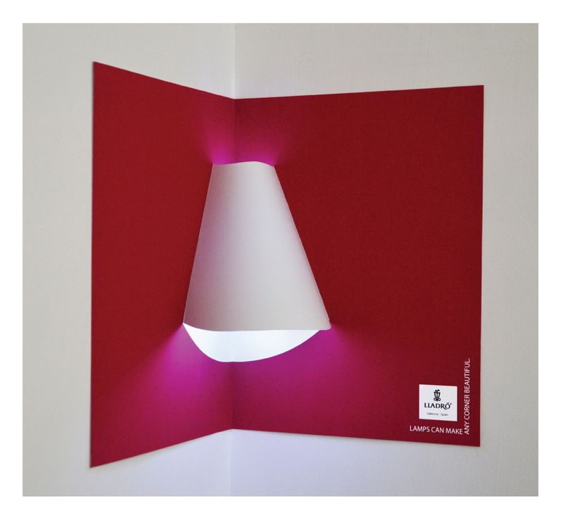


Lladro Lighting 
An ad that transforms into a lamp
- the print acts as a pop-up book, allowing people to create their own lamp shades by mounting the paper on a corner of a room.

- Create something similar using Arjowiggins paper that doubles up as something else when used alternatively.

- The secondary function would have to be something music based

- Create a paper ad that when folded following instructions it creates a speaker / funnel that makes music from a smartphone louder

- Design an interactive weekly poster aimed at a younger audience who would be more inclined to put up posters and to interact with it using a smartphone.


IDEA

These interactive print examples have given me the idea to try to produce something similar as producing something like this would allow me to combine paper samples from Arjowiggins with digital music, promoting both the paper suppliers as well as Sony Music. The idea behind using both print and digital stems from the opinion that in order for print to survive it must be supported in someway by digital. 

The brief asks to 'create a campaign or initiative, service or product with paper at its core'. As the primary focus of the campaign/product will be paper, the digital aspect coming second, an approach like this would be suitable.

My approach to creating an interactive print product will take strong influences from both the office desk paper turn table as well as the Lladro lighting posters. 

Critique session

notes:
- Yes to interactive
- iphone wooden speaker idea - made of paper
- posters ?
  > interactive with smart phone 
- personalised poster & codes
- a pack related to individual artists
- a publication made of posters of artists
  > diff paper for diff poster
  > acts as a discover weekly
- Golden Moments III - Behance
- Posters to include artisits, album artwork, genres, moods etc
- website - choose which pack you want to be sent that month/week
- maybe introduce internet/viral songs for humour
- This idea give the paper range more importance with any interaction coming second

Pitching possible ideas to a group of peers, there was a shared opinion that paper should take more of a predominant role, and then maybe adding a secondary interactive element. However, the interactive aspect whould be used in some way, shape or form to give the final resolution depth and strength.

Spotify print campaign

Spotify has released a global outdoor print campaign with the tagline "Thanks 2016, it's been weird".

Each poster contains localised messages from spotify, driven by data from listeners and pop culture topics relevant to 2016.
The UK billboard reads... "Dear 3,749 people who streamed 'It's The And Of The World As We Know It' the day of the Brexit vote, hang in there".
This campaign is a simple yet effective example of how a purely digital service can make use of print campaigns. The ads themselves say nothing about the service Spotify provides or includes any of the same features. It is solely run on the humour and cleverness of each quotation. Each quote is then site specific according to country its found in. All of these things come together to make a really humorous, light hearted and relatable ad campaign.


Golden Moments III

A promotional book full of examples of the studio's work, showing off their unique style as well as their professionalism.

This would be a great way to advertise Arjowiggins paper ranges as a similar book could be filled with posters and inserts that make the most of a whole range of different stocks and samples offered by them.


The Idea
To design a promotional poster book showing off a range of stock samples from any of the ranges offered by Arjowiggins. 

Content
A series of posters containing music related artwork; album artwork, artist portraits etc.

Distribution
A subscription gets you a weekly delivery of new poster designs. The customer can choose which poster book they want to receive every week, chosen from a different selection each week.
- To make the decision, the website will offer a sneak peak into what each poster book offers.
- The books will be informed by different aspects of music each time; some will be genre related, some will be time related etc.

Target Audience
The target audience will have to be people who are likely to want to hang posters up on their walls. This is typically people aged 13-24.

Interactive feature
There will then be a hidden QR code on each of the posters that, when scanned, takes the user to the song and plays it. This feature is suitable as the target audience are familiar with this concept. Adding this would give the idea more depth as it allows recipients to further engage with the product.

The content of each poster will be informed and influenced by the stock on which it's printed. Some posters will be printed on glossy stocks and so will include more photographic designs whereas the posters on more textured, matt stock will take advantage of those textures in one way or another.