Tuesday 27 February 2018

OUGD603 - EP - Adidas - Where I'm At

Update on Progress
Exhibition Collateral

The first part of the project I decided to produce is the programme that will be given to people attending the event. Below gives an idea of the format and visual imagery I decided on using.

To stay in keeping with the adidas tone of voice, I have kept the design minimal and punchy, using their recognisable typeface throughout. The decision to use yellow was informed by research that suggested yellow is a colour representing confidence, this being a key term in the concept behind the project.

I have used an easy to read layout that doesn't overcomplicate things so that the reader can make sense of the content efficiently.

The visual language for the programme will be kept consistent across all aspects of the campaign.

Stock Choices

The main body of the programme will be printed on gloss or matt stock.

The cover could potentially be printed on yellow stock? and only print black. This stock would be slightly thicker than the inside pages.
  - the paper would have to match the yellow colour of the inside pages.

Alternatively, I could print the cover on similar stock to the rest of the booklet, just slightly thicker.


What Next

The next tasks are to produce all other printable outcomes. This includes:
- Posters
- Lanyard inserts, tickets
- stickers

I will also decide whether this stuff will be included in a pack...


Sunday 25 February 2018

OUGD603 - EP - SHO - Label

Wash Care Tag for
Hoodies and Trackies

The client has asked me to do something for him which is far less glamourous the their previous tasks but one that is important when designing clothes to ensure consistency throughout their identity. They have asked me to produce the 'wash care' tag for their clothes. This was not the most enjoyable task, however it has a lot of importance and taught me about an aspect of fashion designing that would often be overlooked. My workings and final design is below:

Originally, I had designed it to be in colour and in keeping with their branding guidelines. However, we heard back from the manufacturers who told us that it had to be black and white.


This is the tag in use on a pair of their new tracksuit bottoms.


Wednesday 21 February 2018

OUGD603 - EP - Exhibition - Site visits

Primary Research
Visiting Derelict Buildings

As we are still trying to solidify the concept and theme that the content of the exhibition will follow and be informed by, we made the decision to go for a drive and visit the various abandoned buildings that we previously located. We wanted to document them in as much depth as possible which entailed taking photos from as many angles as we could.

Difficulties in accessing the buildings was a limitation to this process. We managed to get up close to all of the buildings in question however it proved impossible to actually go inside. One way we over came the access issue was that we asked permission from a school who's ground the church was situated on. They kindly allowed us on site as visitors if we signed in and showed our University ID cards.

Hunslet Mill


Mount St Mary's Church


Brotherton House


Tuesday 20 February 2018

OUGD603 - EP - Eatery - Brief

Brief & Branding Guidelines


Aim

Rebranding SushiWaka, an authentic, affordable Japanese Restaurant in Leeds city centre. The restaurant lacks any consistent online presence or branding/identity. With a strong brand, the restaurant could attract a higher number and wider range of customers.

Deliverables

Consistent branding and online presence including
- Logo
- Interiors
- Exteriors
- Online presence

Target Audience

At the moment, the restaurant attracts mostly Japanese customers. Through this project, the aim is to attract a larger and wider range of customers including native locals and people of other cultures and countries of origin.

Branding Guidelines

Personality and Key Values
- Playful
- Affordable
- Authentic
- Casual
- Welcoming

Mission Statement
- A casual dining experience that offers authentic and affordable Japanese cuisine in a playful and welcoming environment

Logo Usage
- Collateral
- Website
- Sign above shop
- Window vinyl

Colour Palette
- Dumpling Colour - muted, soft
- Bright, Playful flower colour(s)

Type Style
- Digital Japanese Monotype
- English Alphabet Monotype

Image Style
- Clean
- Colourful
- Bright
- Bold


Monday 19 February 2018

OUGD603 - EP - Eatery - Restaurant Visit

Visiting Chosen
Japanese restaurant in Leeds

The restaurant we decided to choose is Sushi Waka located at the end of The Headrow in town. For research purposes, we thought  we would visit the restaurant and experience dining there. Whilst we ate, I documented a number of things about the restaurant and their existing branding. For the time being, we decided not to tell them we are doing the project in case they have a problem with it. If we require photos of inside the restaurant, we will ask.

Below are some images that represent the aesthetics and existing identity. One of the reasons for choosing this restaurant was the fact that they don't have a strong branding or identity and an even worse online presence.

I have documented the elements of the restaurant that we intend to redesign.

Menu Design


Side dish, side plate and chopsticks

Opportunity to brand chopsticks, chopstick sleeve etc


Tea Set

Redesign and brand their own tea set?


Food


Drapes, tapestry


OUGD603 - EP - Exhibition - Initial Ideas

Collaboration Project
Putting on a Show

I met up with two designers on my course to discuss an idea we had earlier in the year. The idea was to curate an exhibition showcasing work of ours.

The first thing we needed to discuss was the purpose of the exhibition as well as the content. The decision was made to fill the show with work made specifically for it as opposed to just showing work we've already done.

The next step was to then decide on a theme. For this, we brainstormed a number of ideas that would interest all three of us in the group as we deemed this important in order for each of us to gain from the experience. After some discussion, we decided that we should make the subject of the work relative to the city of Leeds. This is so that it has its own place in being shown here in Leeds, this will also attract locals and others who have connections with Leeds.

We then had to think of a more specific area for exploration. We narrowed our options down to either looking at Architecture in Leeds OR the music culture and history. After further discussion, we chose architecture as this was a common interest of ours and it also presented us with more options for the work we will be producing.

After this, we each spent some time researching Leeds architecture in order to come up with a theme or narrative for the event. Then Alec had an idea to look more specifically at places in Leeds that most people would oversee or not consider at all. This then gave us another branch of research in which to explore. From this, we then discovered that around Leeds there are a large number of derelict buildings which once had a lot of importance but are now forgotten about.

Building Research

Hunslet Mill


Elinor Lupton Centre


Brotherton House


Holbeck Viaduct


Tuesday 13 February 2018

OUGD603 - EP - Eatery - Research

Choosing a Restaurant
Leeds

For my next brief, I have chosen to rebrand a restaurant of my choice in Leeds, collaborating with a designer on my course. As we are both very interested in Japanese Design we made the informed decision to brand a Japanese restaurant. The other informed decision made was to choose a restaurant situated in Leeds so that we can visit the site, eat there, experience the place as well as closely document the existing branding.

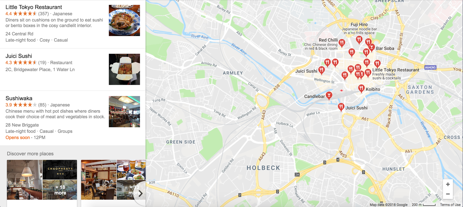
The first step is to choose a Japanese restaurant from the many in and around Leeds City centre. Below is a map containing all of the possibilities.


Sushi Waka

Google rating : 3.9

The description given by Google is a Chinese menu with hot pot dishes where diners cook their choice of meat and vegetable in stock.

This is very confusing as the name implies they serve sushi and comes up when searching for Japanese restaurants in Leeds. As well as this, they currently don't have a website which is very rare of restaurants these days and will have a big impact on their success.

These problems present a perfect opportunity for a rebrand as this confusion should be dealt with as well as a website being built.


Koibito

Google Rating : 4.7

Clearly a more successful restaurant and highly rated, Koibito is described by Google as  Japanese restaurant which is supported by the images. There is no confusion as to what food they serve, unlike the previous example.
The restaurant itself has large murals on the walls communicating typical Japanese art and design adding to the experience.
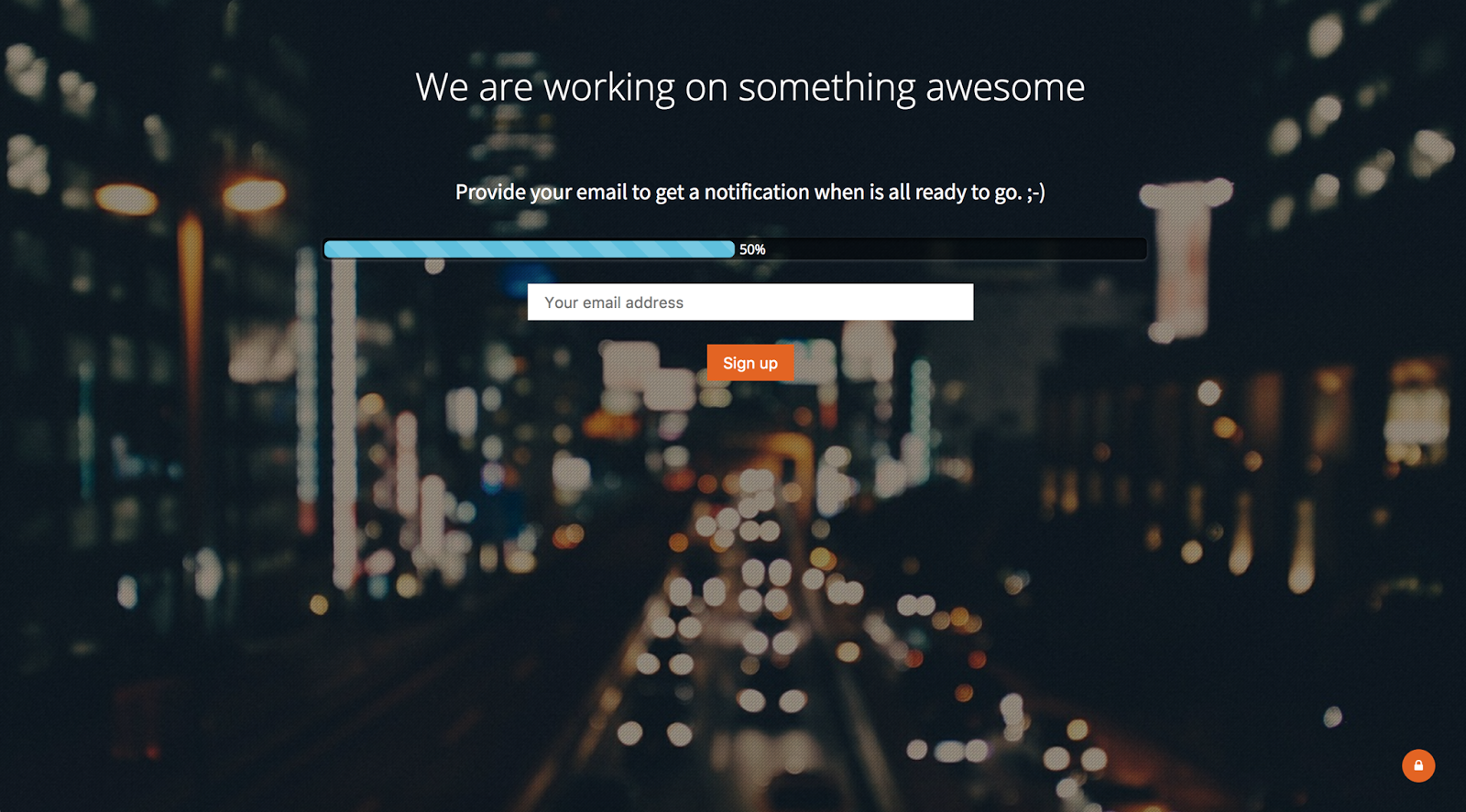
When trying to view their website, I came across this page stating that they are 'working on something awesome' implying that the website is being updated. This means that their branding is already getting attention and so would be pointless for us to carry out.


Issho


 Google Rating : 4.1

This is a very recently opened restaurant situated at the top of the new Victoria Gate complex. It is very high end fine dining which I personally enjoyed a lot.


Their branding is highly professional and successful. Their website is slick and very Japanese looking. The navigation around the website is thoroughly enjoyable. This is an example of the effect a good website and branding can have on potential customers.

Highly professional and high resolution imagery paired with a good consideration of type.

This will be inspiration for our own development. However, this is much more high end than the other restaurants.


Little Tokyo

Google Rating : 4.4

Little Tokyo has a decent rating and has had a a reasonable amount of publicity.

However, their website tells a different story. This is another good candidate for a rebrand. The website is incredibly basic and has no consideration for aesthetics or navigation. The colours used are contrasting and offensive.

Monday 12 February 2018

OUGD603 - EP - Adidas - Logo Design

Now that I had decided on the concept of the project, the next step was to come up with a logo and slogan for the project.

I listed a number of words relating to the concept...

- career
- employ
- employability
- confidence
- inspire
- job
- ambition
- future
- industry
- meet
- together etc....

The name I decided to go with was Creative Edge. This is first informed by the fact that the events will be aimed at young creatives. The word Edge is informed by the fact that the aim of these events is to help creatives to be more confident in their ability and rid them of the anxiety that comes with finding a job or choosing a career. The events will give them an edge above the rest in a number of ways.

I looked at a number of Adidas campaigns for research and noticed that they don't tend to design distinctive logos for everything they do. I took this into consideration and designed one that is mainly using the Adidas typeface but with a slight manipulation. The decision for this was based on the fact that creative events such as this tend to have a strong identity and branding as this will appeal to the target audience.

Below is the chosen logo as well as the process behind how I got to it...


Chosen Logo
Informed by the event aiming to help give young creatives confidence in finding a job and giving them that 'edge' amongst the rest, the only manipulation involved in the design of the logo is the word Edge sitting on a higher line. Apart from this, the logo fits with Adidas branding.

The slogan for the campaign is...

"Inspiring Confidence In Young Professionals"

NEXT TO DO...

The next step of the project is to decide on the deliverables and final outcomes. This will include, but not be limited to:

- Website
  - Sign up Page included
- Programme
- Adverts (buses, billboards, social media)
- Visiting Professional ID cards
- Merchandise
- Venue Decoration
  - Banners
  - Signage

Logo Redesign

Once I started to use the logo, it became apparent that it would be quite difficult to use in context due to it's shape and size. This led me to rethink the logo design to create something that looked more like a recognisable logo.


Final Resolution: far right and left