Wednesday 26 October 2016

Final Layout and Composition


I have chosen to compose the katakana characters in a very simple and minimalist way. This is firstly informed by typical Japanese design being minimal and tidy with no added mess. The other factor that informed this layout is the fact that the aim is to make the book as easy to use for the reader as possible. By keeping amount of detail and info to a bare minimum, this has resulted in a really clear and tidy format. This is then further enhanced by the fact that every page with katakana characters is set out using the same grid and is always found on the right hand page of each double spread. This allows the reader to flick through the book and is able to see all the characters at a quick glance.


For the opposing pages, I have included one image. Some images relating to the characters on opposing pages such as the first example on the left (the image includes one of the characters). Other images are just of my journey around Japan and highlight aspects of the country that I deem interesting. I have tried to match the images with the colour of the chapter as much as I can as this helps opposing pages relate to each other and work as a composition.


body text is also used on a few of the spreads describing something about the photo or location. This is informed by the design of guide books I had a look at for my research. the combination of a translation book with a simple guide book teaches people the alphabet as well as points of interest about the country itself.

The decision to use a large range of different layouts for the left hand side was informed by the fact that each opposing page follows a very strict grid system, making them consistent throughout. Therefore, having different layouts of images helps to relieve the consistency a little and engage the reader, making sure it's not too monotonous to look through. 

For the beginning of each chapter, I've designed a layout that leaves the katakana character right in the centre of the page in large. This making it immediately obvious which chapter they are at. The next focal point is the english letter to the right hand side that is the translation. The readers eye doesn't have to travel far at all to reach the definition.

Below, I've included some info about the Japanese language and its origins. This making the book more informative and interesting.

I have laid it out similar to a dictionary to give it status and importance and to assure the reader that what they're reading is legit and trustworthy. This is the same reason I chose a serif font, this is widely associated with academic journals and books.

Friday 21 October 2016

Binding & Case Binding

Binding

Multi Section Bind

The decision to use a multi section bind for the content of the publication is informed by the structure of the content itself. As the book is divided into 5 sections for each vowel, the book will be printed as 5 separate chapters, similar to the example on the left. The sections will then be stitched together using the technique shown. Considerations include keeping the stitching tight to keep the structure of the book.


Case Binding

The decision to add a hard back cover to the book is informed by the idea that the book will need to be durable and tough to withstand being carried around my tourists in Japan. The hardback cover will give this durability as well as making it slightly water resistant incase it gets rained on or spillage. 

The first experiment was to find out whether it was possible to use the chosen front cover stock instead of buckram to produce the hardback cover. 

This worked well, however the finish was not as perfect as intended. Reasons for this include that there were bubbles of air left underneath the stock. The other disadvantage is that the stock will have the final front cover design in it, and it would be very risky to glue it straight onto the mounting board as it would be difficult to line up and make fit.

Other imperfections were found on the corners and edges. The stock creased easily and so the edges were not as smooth as the buckram.
The second option is to use buckram for the hard back cover and then produce a paper cover that fits over the top with the design on it. This worked a lot better as the buckram allowed for a more professional finish and using the stock as a cover means it will be easier to line up and get the dimensions correct.
What is also successful with this mock up is the vibrant red that is exposed on this inside when the book is opened. I will be using this to full affect in my own design, possibly introducing a typically Japanese pattern onto it.

Thursday 20 October 2016

Comparing design organisations

Comparing design organisations

Tone of Voice

D&AD

Annuals/website

- corporate
- clean
- structured
- dynamic
- dense
- visual
- commercial, paid work
- serious  but with creative edge
- intimidating


YCN 

- inspiring
- experimental
- more creative
- playful
- tactile
- expressive
- vibrant
- understated

These two are almost like yin and yang, complete opposites of each other.

What has influenced the work & how have they made this clear

Consistencies in Award Winning Work

- nothing is open to interpretation
- placed in context
- D&AD felt like real commercial briefs, YCN more hypothetical
- Campaign - work could be transferred to other contexts, media e.g. apps, website etc
- impeccable presentation
- idea & concept driven
- Innovative

Wednesday 19 October 2016

Colour Swatch

What informed my choice of colours

For each 5 categories that make up the content to the publication, I have assigned a colour. This is to make finding each character quicker for the reader.

each design category uses a different predominant colour, this will then correlate with the tab system on the fore edge of the book. I wanted to make sure that my choice of colours would be informed by the content.


Japanese WoodBlock Printing

When thinking about what colours would be associated with Japan and its culture, I immediately thought of the designs I came across by traditional woodblock printers.

Woodblock printing is one of the oldest art forms and dates back from as early as the 17th century. This means that it is an art form that is fully embedded within Japanese culture.

This gave me the idea to use colours typically seen in these prints as the colours for each of the categories. 


This is the colour swatch that runs through the publication. Along side each colour is the katakana character that titles each category.

The colours typically represent nature, water, autumn, blossom and the Sun in Japanese woodblock printing.


Tuesday 18 October 2016

Choosing Stock

Main Body Stock

My next design decision is to choose a relevant stock for the main content of my publication.

My first idea was to use a delicate stock as this would be informed by the delicateness of Japanese design. However, I decided against this as my book needs to be durable and weather resistant as it will be carried around by the user in all weather conditions. 

The stock has to work for both printing the characters and images onto. If the stock is too delicate or textured, the imagery wont come out well enough.

The stock can't be too thick as the book will have a number of pages and I want to avoid making the book to heavy or thick so that it can be carried around easier.


Inspired famous artist Yayoi Kosami and other Japanese art, the stock here includes a simple polka dot design that would suit the Japanese style of design throughout my book.

This stock, and the red one below, would work well as an opening page for decoration. However, it would make things overly complicated if I were to print my content onto it.
The combination of red and white would be recognised as the colours of the Japanese flag.

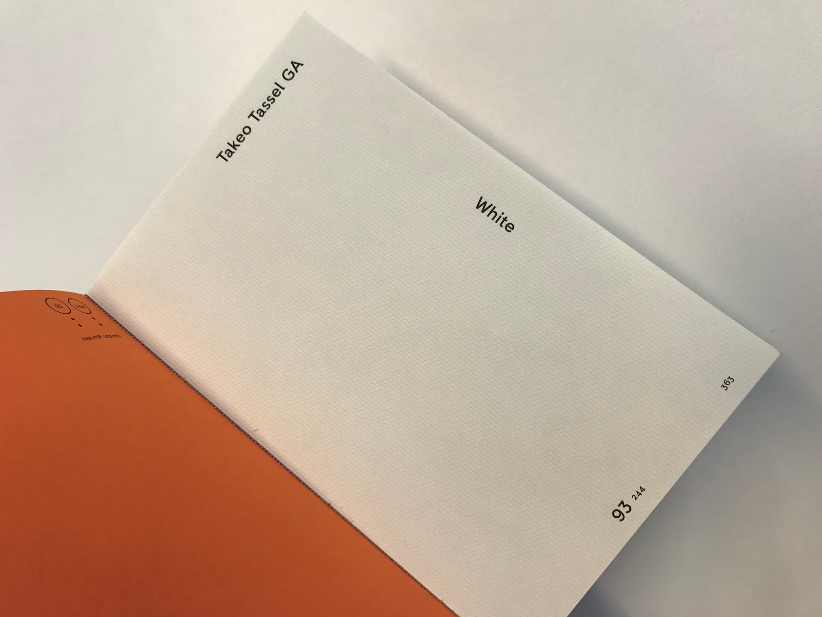
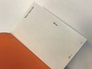
The Takeo Tola range of stock in the G F Smith book are Japanese style papers. They are delicate and soft to the touch. This would work well as my content stock, the only disadvantage would be that they are slightly textured and may effect the quality of print, especially the photos.

I've photographed stock at 80, 93 and 120 GSM to get a range of options. I think that a stock around 100 GSM would be ideal for my content as it wouldn't be too heavy but would allow for a sturdy and durable book.


I went down to the digital print room to investigate using traditional hand made Japanese paper. However, after finding out that it would cost me an arm and a leg to use, I have had to look else where. One idea is to invest in the hand made paper to use as decoration in the front/back of the book, maybe for the contents.

A major floor with this style of paper is that it's not durable and may tear if carried around.

IDEA

I am going to invest in some hand made Japanese stock that I will print the title of the book on as well as a typical Japanese pattern. This page will then feature after the front cover,  before the main body of content. 

Critique on my Progress


Getting feedback on where I'm at so far

To find out where I'm at and where I should head next I wrote down some question for my peers to answer. 

I first wanted to know if my page layout for the characters was too simple and if it needed any more detail or info. 

" No, the page isn't too simple as the simplicity adds to the ease of use"
" The consistency and simplicity helps the user make sense of the content and refer to it quickly and easily"
" The clear and tidy layout resembles Japan and its precise and clean culture and surroundings"
" If there were any more detailing, it would become harder to read and use"
" maybe look into introducing a small bit of detail, maybe a soft Japanese pattern that is only just visible"

The general feedback for this question was that the layout is not too simple and in fact adds to the ease of use. It also taught me that the simplicity is informed by Japan itself.

The next question I needed answering was the layout of my images of the opposing pages. I have chosen to use a mix of different layout styles, some including text and others full-bleed imagery. I wanted to know whether this worked as a series of layouts or whether I should simplify it or make them the same.

" The mix of layouts works well in contrast with the uniform layout of the characters on opposing page"
" Makes for a more interesting and engaging layout"
" allows for each image to be suitably and effectively laid out"

The feedback for this was also a positive one and so I have decided to stick with the mix of layouts.

Other Comments

- try to inform each colour choice for the chapters. Find a reason for using each colour
- relate colour to the choice of stock and printing method so that they all work in harmony 
- binding method of section perfect bind is suitable and makes sense according to the content being in categories.

Where to head next...

My next steps to take are to 
- choose the stock I want to use for the hard back binding and the main content.
- try to make decisions on colours used informed by content


Designing my Katakana

Katakana Illustrations

Each chapter of my book contains 1 of 5 categories of the katakana alphabet, each category represents sounds ending in each of the 5 vowels we have in our alphabet.


I wanted to design the characters in a typically Japanese style whilst making the content more enjoyable and interesting to look at. I looked at a number of styles used in Japanese design including cartoon and anime styles.

I decided on the colour shadow with the white light spots. The version with the dots behind looks too complicated and confusing. The grey shadow looks too boring and not playful enough.


I've taken influence from playful and eye catching Japanese publications I found online to design my katakana characters.
This typography is well recognised and has clear a relationship with Japan, the location of my content. As my publication is mainly just a dictionary, I have made sure to design the content in a playful and engaging way, this will make the book more enjoyable for the user along with making it easy to use through tabs and colour coding.


Each chapter will have an introduction page like the examples above. Each character indicates the last letter of each sound found in that chapter. I chose 5 bold colours 

For example, after the intro page with the green character on it (translating into the letter U), there will be the pages that include every pronunciation ending in U within the katakana alphabet and so on.


Thursday 13 October 2016

Hardback Design

Hardback Book Covers

Durable & Resistant

I have made the design decision to produce my publication with a hardback cover. This is inspired by the Monocle guides and will give my book durability. This is important as the book will need to be carried around, it will also make it water resistant.


This is an example of a hardback book that has been printed onto. This is similar to what I had in mind, however my aim is to design the front cover using bold, playful colours and I don't think that I would be able to make the colours as bright and bold if printed onto textiles.


This gave me the idea to produce a sleeve. This would allow me to use a material/stock similar to the one above but also produce a bold and bright cover that would grab the attention of the buyer.

However, after giving it thought, I decided that a book that needs to be referred to often and easily would not benefit from having a sleeve and it would only add hassle for the user. 


This sleeve is combined with the cover of the books inside to create a new design. The book is titled maze, and so the design decision to produce this was informed by the content.


I have signed up for a book binding tutorial so that I can better my understanding of hard back books and perfect binds. I want to know whether its possible to wrap the hard back cover in a paper stock. This is because I want to achieve a bright and colourful cover which would only work on certain paper stocks.

Wednesday 12 October 2016

Layout Research


LAYOUT

Gavin Ambrose & Paul Harris

To better my understanding of layout and grids, I got my hands on a book that explains, in depth, each important consideration of publication design.

- layout is the arrangement of the element of a design in relation to the space that they occupy and in accordance with an overall aesthetic scheme
- where and how the content will be viewed regardless of whether the final format is a magazine, website or package design.
- guide book communicates its content differently to a thesaurus
- 'The use of the grid as an ordering system is the expression of a certain mental attitude inasmuch as it shows that the designer conceives his work in terms that are constructive and orientated to the future' - Josef Müller-Brockmann

Entry Points

an entry point is a visual aid indicating where to begin reading
- e.g. newspapers contain textual content separated into discrete chunks - without this separation, the content would be too dense 
- the placement of an entry point can form part of the visual drama of a spread
- typical methods include using colour and font alterations

Scanning and Reading

- eye tracking software used to see how people scan a page, looking for an entry point


< showing common patterns of reader behaviour
- we tend to read from the top left corner in either an 'F' shaped pattern or scan over a page ending at the top right corner
This annual review demonstrates the use of entry points in a design.
- a main headline captures the reader's interest 
- this is combined with a coloured rule, leading the eye across to the right-hand page
- the image placement, by spanning the gutter, also helps lead the eye towards the copy.

- the careful placement of elements will help to guide a reader around a printed page
- its as much an art as it is a science, designer must develop a 'feel' for layout 

what I want my readers to do is for their attention to be grabbed primarily by the katakana character and then lead onto the translation. As for the spreads including image and text, I will experiment with a number of relevant styles I've previously explored. This will include influence from Japanese style books as well as ones like Monocle and LOST iN.


Appropriation

appropriation is the borrowing of a style, typically used elsewhere, as the basis for a design.

- this can be done purely for aesthetic reasons as a method to present info in a certain way
- but often it is done to borrow characteristics that are associated with the appropriate source
(in my case, Japanese design)


Page Layout Ideas


Primary Design Stages

Getting it down on paper

After extensive research into existing publication design and time spent organising my content, I made the decision to start trying out page layouts for my final design. This is so I can gage how many pages I will be working with as well as the best and most effective ways of organising and setting out the content.


For my final designs, I will be using grids throughout the publication to organise the content, however in these primary stages, I have decided to experiment more first without the use of grids so I have more freedom to play around.

My thoughts on how it should be laid out were based around having the Katakana character as the main focal point of each page and having the translation as the next main focus. I also wanted to try and fit in one or more of my images as well as body text (topic of text undecided so far).

I want to keep the spreads very minimalist and tidy to correspond with what I think Japanese design stands for. This means having only a few components to each page.
My next design decision was based on one of my previous decisions to include playful design typical of Japan. To do this I manipulated the Katakana character by adding shading and lighting to resonate that of my previous research. 
As well as being playful, I also want by book to include plenty of colour. However, I do not want the colour to distract the reader and confuse them so I had to find the right balance between white and colour.

As an idea, I also added a writing exercise at the bottom where users can practice writing Japanese characters. This will engage the reader and allow them to make the book their own.


Through extensive playing around and rearranging, I came up with the layout on the left.

I have placed the large Katakana character right in the centre of the page so that the readers attention is drawn straight to it as they find the page. The reader can then see the translation straight away by looking just to the right of it. This makes translating the character quick and simple.

I have changed the font from a sans serif one to Baskerville (serif). This is because I want the book to have the status that a dictionary has to convince the reader the info is trustworthy and reliable.

I have used minimal colour influenced by the design of Monocle guide books. Without being too confusing or over the top, they use only an accent of colour here and there. This sets it apart from the ordinary guide books as they are usually very bland and have a very limited use of colour.

Each of the pages shown here would act as the category dividers as each category will include pronunciations characters that end in each of the vowels.


Tuesday 11 October 2016

Organising Content

Katakana

Making sense of it


The main body of content in my publication will be translations of the sub category of Japanese characters called Katakana. Within this group there are just under 100 characters. I have to some how come up with an efficient and easy to use way of organising this content to allow the reader to locate the character they wish to translate quickly and easily.

Through investigation, I came across a couple of methods used in books to help readers find what they need quickly and efficiently. The two most popular and most effective methods are the use of tabs and colour coding. This gave me the idea to organise my content into a small number of groups; this would allow me to use either of these methods to organise my content.

When looking at a grid of Katakana (on the left) I tried to see if there were any common relationships between them. I noticed that all the pronunciations of the characters end in 1 of 5 vowels of the english alphabet (a,e,i,o,u). This gave me the idea to divide the character into vowels, resulting in 5 different tabs/colour coding.

Below, I've colour coded the table of characters into 6 different colours; 1 for each vowel as well as one for extras.

Some characters will have a whole page to themselves, where as other pages may include 2 or even 3 characters. This means that the book will contain around 60 pages of characters and the translation.


To make sense of the characters, along side the chart came a list of translations into english pronunciations which I used as a reference. I matched up each number code under each character with the matching code on the reference list.


So that I could type out the correct corresponding katakana character, I found a language calculator online that allowed me to enter the english pronunciation and it would type the character into the box. I then copy and pasted this into Illustrator where I edited them in my chosen style.


Tabs 
Organising the content into categories

This simple tabbing system is made up of a number of thick stocked pages that are a few millimetres wider than the rest of the book. They act as dividers that the reader can then use to locate the section they need.

The disadvantage with this method is that the dividers are made of medium thickness and so are quite weak and flimsy which, if carried around a lot, would become torn and misshapen. As Im making a guide book, I need the book to be sturdy and able to withstand being carried around in a bag.


 This method is a lot more durable an sturdy as the pages behind the tab strengthen it and prevent ware and tare. The only disadvantage of this method is that it requires a larger number of pages than I have.
This technique is one that would suit my publication the best. These tabs are simply a series of semi circles cut through the pages at various positions exposing different layers.

This method would be easy to execute and would also be durable and strong.

My contents page would include a table of Katakana characters organised into groups of vowels. These groups would then be colour coded and that colour would match the coloured tabs. This will allow the reader to locate each character quickly.