Japanese Design
Looking at sites such as Behance and Pinterest, I've started to explore ways in which I can make links between production and materials with the content of the book. As the content is Japanese language and culture, I have been looking specifically as existing Japanese publication design.

I found a project on behance that I deemed as typically Japanese design through the stock, binding and colour themes.
The stock is a thick, textured paper of a thick GSM. It has clear links to Japanese culture as it is delicate and is similar to Japanese package design.
The front cover is cleverly simple with a single red dot to resemble the countries flag.
The efficiency and simplicity of Japan is mirrored in the overall design of this book with small details neatly formatted on delicate stock.
This is what I also aim to achieve through my own design and so shall take strong influence from this project.

The publication on the right is formed of two separate publications bound into one. They are bound together with thick card attached on opposing sides of each publication. This forms a Z shape with the two.
The content is Japan around world war II and acts as a tribute to the lives lost during including the atom bombs.
The use of the Imperial Seal throughout the book represents the power of the Japanese Empire after the Meiji Restoration.
The book is made up of only three colours; white, red and black. This limited colour pallet is effective in resembling the Japanese flag.
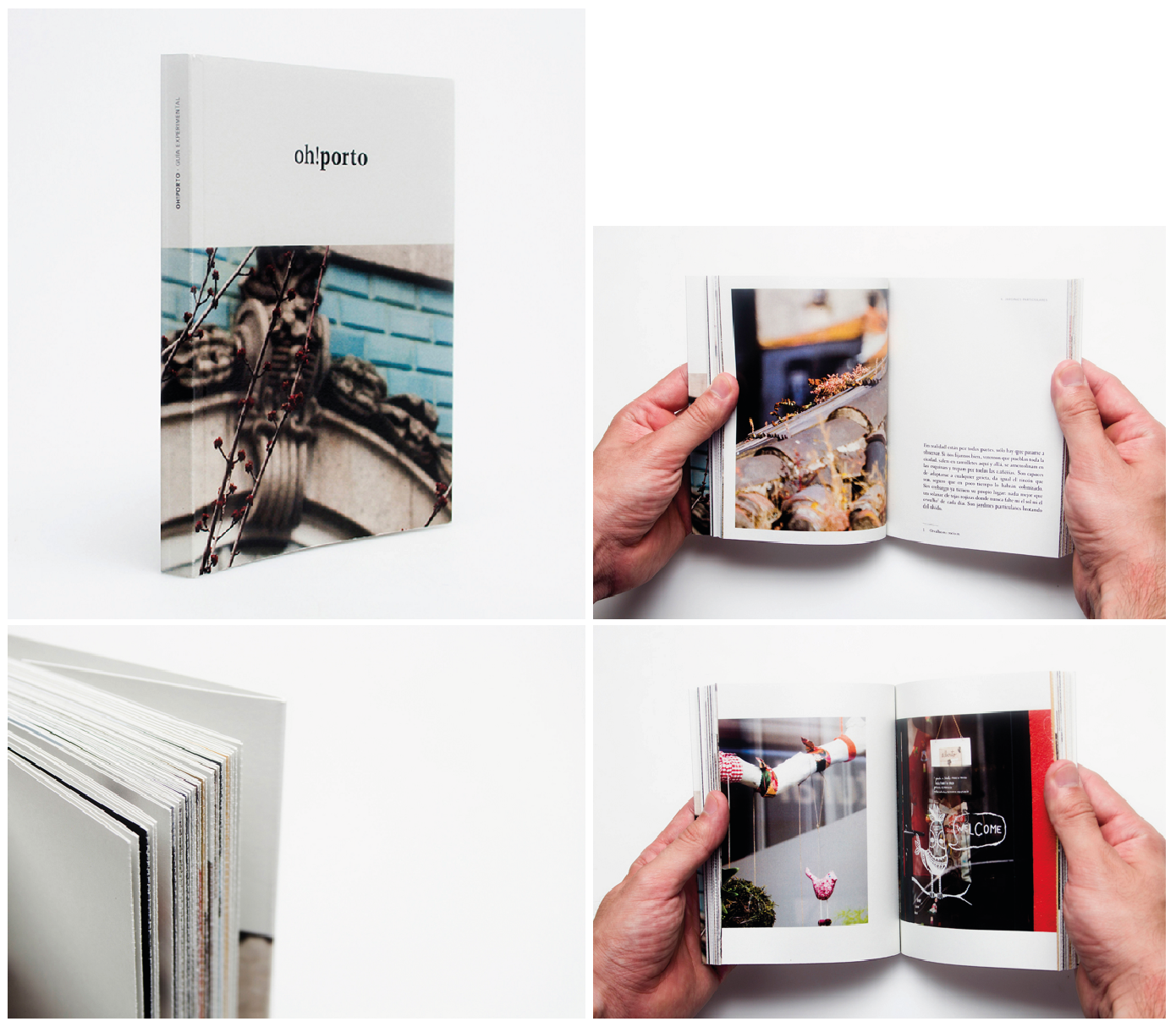
oh!Porto is a guide book for visitors written from a locals perspective.
"The main purpose of this publication/edition is to provide a different and complementary reading of the classic tourist standards. Thereby, the texts exposed in the guide should not be considered as unique or universal, instead they must be interpreted abstractly so, as time goes by, new and original points of view of the city will be created."
The designer and author of this book has put a unique twist on regular tourist guide and has achieved a niche and exciting publication.
Further Japanese Design Ideas


 A lot of Japanese design I come across is playful and full of colour. This is reflected in their culture through the huge anime industry.
I visited a city outside Kyoto called Osaka where we were told to go and experience the buzzy atmosphere. We were not disappointed as we came across the crazy high street running along the river. It was full of giant 3D signage and noises from the massive arcades and foot stalls.
Using a similarly vibrant and exciting style, my publication would stand out from all existing guide books thats I came across.


 Little Tokyo food menu uses a two tone colour pallet along with typically Japanese illustrations and type, creating a strong and cultural design.

 I will be aiming to design my publication with simplicity and clarity and so will avoid any unnecessary mess or clutter.
However, in my opinion, the project on the left is too simple. Thinking about how well my book must sell and stand out amongst all existing guide books, if it were too plain and simple, it would not get notices. This is why I have looked at design styles such as the examples above as they have a much better chance of getting noticed.


Further Japanese Design Ideas


I visited a city outside Kyoto called Osaka where we were told to go and experience the buzzy atmosphere. We were not disappointed as we came across the crazy high street running along the river. It was full of giant 3D signage and noises from the massive arcades and foot stalls.
Using a similarly vibrant and exciting style, my publication would stand out from all existing guide books thats I came across.


Osaka, Japan


Japanese food menu


However, in my opinion, the project on the left is too simple. Thinking about how well my book must sell and stand out amongst all existing guide books, if it were too plain and simple, it would not get notices. This is why I have looked at design styles such as the examples above as they have a much better chance of getting noticed.


Cereal is a website that sells a series of tourism guides.
Alike the example above this image, they're incredibly simple and minimalist with an extremely limited colour pallet. I usually admire minimalist design such as these but as I intend for my publication to stand out on a book shelf, I will be avoiding this design and using more exciting and playful colours.
Along with their guidebooks, they have created web pages for a number of different cities. They advertise the location in a slick and elegant way through the use of amazing photos and serif type.


Although this brief doesn't include any digital based design as yet, it is always important to think of how a publication can be translated onto a screen in this day and age.
 Whilst exploring Behance for existing Japanese design, I stumbled across a projects that I really admire.
This is a branding and identity project for a new Japanese tea house that opened up in Manchester. It demonstrates the delicacy and attention to detail that is often found in Japanese society.
What I hadn't realised until I scrolled to the bottom of the page was that the designers behind it are actually the boys who work at Alphabet here in Leeds.
 "The tea house aims to capture the tradition and heritage of Japan in a clean, sophisticated and contemporary way that works for the Westernised market"
A quote taken from the project description is very similar to my own manifesto.
I also aim to appeal to a westernised market whilst at the same time showing clear influence from Japan as a country.
Alphabet

This is a branding and identity project for a new Japanese tea house that opened up in Manchester. It demonstrates the delicacy and attention to detail that is often found in Japanese society.
What I hadn't realised until I scrolled to the bottom of the page was that the designers behind it are actually the boys who work at Alphabet here in Leeds.

A quote taken from the project description is very similar to my own manifesto.
I also aim to appeal to a westernised market whilst at the same time showing clear influence from Japan as a country.
No comments:
Post a Comment