Field Research
tourist guides
I went to find out what books I could find that are already out there in the market in the centre of Leeds. Specifically I was looking for existing tourist guides and language books as I my publication follows those genres.
My perception of tourism publications before my research was that they're most often very ugly and purely designed for functionality with not a lot of consideration for design.
The first shop I headed for was the Village Book Store which is one of my favourite shops in town. I asked the man behind the till if he had any books on tourism and he pointed me in two directions.

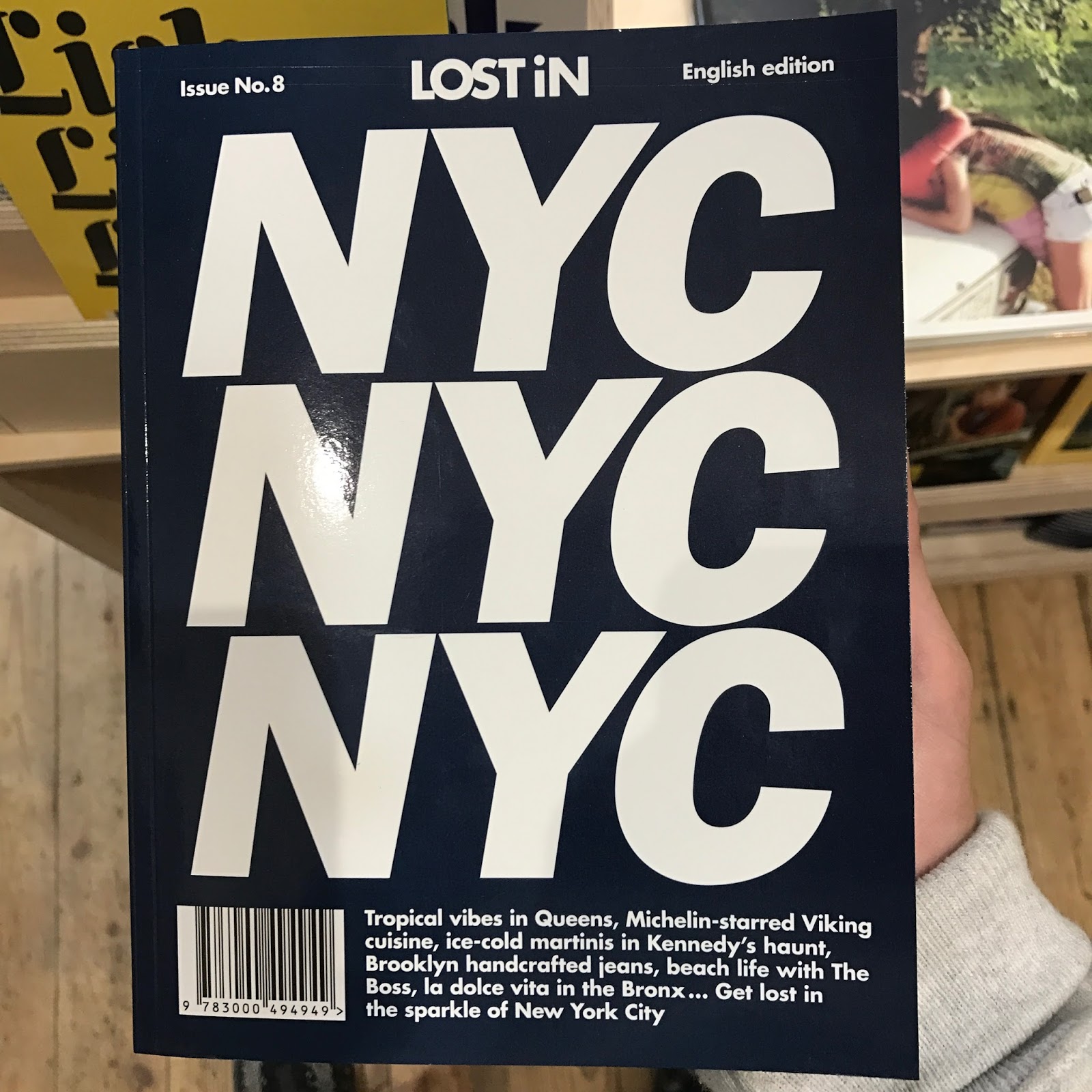
The first was a series of books called 'Lost in' that included a number of different guide books for cities all over Europe and the rest of the world.
Immediately the books caught my attention with their bold and colourful covers. Each cover is simply made up of the destination name written out a number of times in a typeface recognisable to the city as well as the colour being suited to the country. It is an incredibly effective use of type and simple at the same time.
The way in which the books are displayed allow for the viewer to see the clever design instantaneously. If they were bunched up in a row on a book shelf, they wouldn't have nearly the same effect.
Below are some photos of the NYC edition. I plan on buying one of them and referring back to it when I come to designing my own page layouts. These books gave me the idea to not only include my characters, but also include information about the locations of each image. This giving the book more interesting and engaging content.


The second series of guide books he pointed me to was a series I have previously mentioned and one that I in fact used myself when navigating around Tokyo.
Although these books were displayed on a bookshelf, only exposing the spine, I think that they are still able to catch the attention of viewers successfully through the use of coloured circles stating the edition number. The destination name is also displayed in a bold, clear and high contrast typeface.
One aspect that doesn't work as well as the others is the use of one colour for each book. Having them all black makes them slightly less interesting and engaging however it means thats the tone of voice is more serious, in turn telling the user that it may be more useful and include better info.


For my own publication, I will be adopting a similar layout technique as I have mostly images but would like to include some extra info about Japan to keep the reader engaged.
Waterstone's
As well as what I would consider to be well designed publications, I also explored what Waterstones, a much larger and commercial store, had to offer. I found my way to the large travel section where I came across a huge variety of tourism and guide books covering all corners of the globe.

lonely planet's book on Japan is a very thick, heavy book full of a vast amount of info.


It has given me the idea to add something similar to my publication as it provides the reader with further useful info whilst not adding too much weight.

In my opinion, I wouldn't use one of these books if i were exploring somewhere as I'd spend most my holiday looking down into the book trying to make sense and digest the info.
What I aim to achieve with my own project is a clear, simple and to the point book that helps the reader to have a more enjoyable read.

The second book I picked up was a lot like the previous one however it also includes double and single full bleed images to break up the text. This had a huge effect on the me, the reader, as I was far more inclined to flick through the book and would have chosen to buy it over the lonely planet's edition.
It used a similar navigation technique on the fore edge but was easier to use due to the larger range of colours used to separate each category/chapter.

As the user will want to find which character he has located quickly and easily, I will have to include a system similar to the one on the left.
My first idea was to use tabs, however after giving it some thinking I realised that there were too many characters to do a tab for each one. I could separate them into categories but this may over complicate things.

Following on from one of the 10 mistakes of book publication I looked at earlier, I started to think about what the spine of my book should look like in order to grab attention and stand out on a shelf.
I took some photos of the shelf that contained the Japan guide books to see which designs stood out to me as ones I would pick out of a selection.
The wider spines have immediate effect as there is a larger area of colour and larger text. However, some subtle differences of other designs allowed for them to be seen such as the combination of pink and black and the use of electric reds and blues.
 I was less inclined to pick up a book if it had too much going on on the spine.
Another thing I noticed that made me noticed books was when they were part of a series of books that were lined up together. This gave them more of a presence and stood out as a block of colour.
These are a lot smaller than what I had in mind but this research has taught me not to make it too small as it could be overlooked or thought of as novelty/less practical.

Berlin
One of my favourite examples I've found of existing guide books is this one. At first, the brown and uninteresting front cover did not grab my attention and put me off opening it at first but I'm glad I eventually did because it is very similar to what I have in mind for my own.
The book is of a small, convenient size that could be carried around whilst exploring Berlin. This is roughly the size I will be using, I will however be experimenting with the shape.

This system is still an option for my own design, I just need to work out how I would categorise my characters.

This technique being an effective way of allowing for expanding imagery and function such as a map. This would be a useful feature in my publication, and there are a number of different uses for this technique that I will explore.
No comments:
Post a Comment