Studio Brief 02 - What is a Book? //
For the next studio brief within the design principles module is to produce a book of 10 double page layouts on a topic that interests us.
As well as communicating the chosen interest, the publication must also demonstrate an understanding into the fundamentals of grid, layout, type and format.
Things to consider include...
My chosen topic of content is Skiing.
Skiing is one of my biggest passions in life and has been from a very young age. I fulfilled a life long dream during my gap year of becoming a seasonaire in the Swiss Alps. This was the most amazing experience of my life and I will no doubt be going back out once I've graduated.
One idea I have had on the content is to produce a book of piste maps. I came up with the idea when I was brainstorming about skiing in general and was thinking of publications that already exist in the environment.
Piste maps are the maps that skiers use to navigate around the mountains. It includes details such as runs, restaurants and chair lifts.
These maps are notoriously difficult to use as they are often very complicated and hard to read. The text can be very small and the intersecting lines of different colours and weights can become confusing.
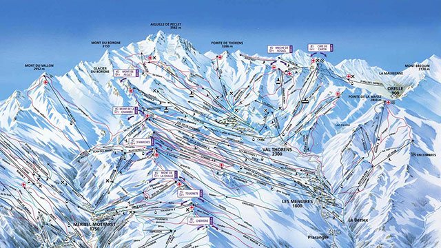
Above are a couple of examples of piste maps. They are extremely complicated and detailed. The text is extremely difficult to read and with so many intersecting lines, it's hard to know what goes where.
Once you are used to using one, they become a lot easier to use and after a couple of days, they do give you a strong understanding of your surroundings. With so much details to fit on a hand-held map, it's not surprising that they are often very complicated at first.
One problem that I aim to fix is to design piste maps in a way that is easier to use and understand. I will be exploring format, colour and a number off other aspects to achieve this.
A few ideas I have had include designing each map using only two colours. This will simplify that map, however it will take away some of the practicality.
A second idea is to split the map's info and spread it onto a number of different maps. By this I mean, there could be 3 maps for one resort... A Beginner, A Medium and Confident map. Each of them will include different slopes and ski lifts depending on the difficulty.
The map above is a lot easier to understand than the previous. This will be down to a few design decisions. The detail of the mountains themselves has been softened and simplified, this results in the details of the map being clearer and more legible.
In order for piste maps to me portable, they are most often designed to fold up and fit in your jacket pocket. This is all well and good for when it's blue skies and fresh snow, however when the wind picks up and there's rain or snow falling, they become very impractical. The folds and corners become weak with moisture and ware and the large A3 spread acts as a sail in the wind.
A design decision for my book of maps will be that it has to be portable and practical in all weather conditions.
As there is a huge number of ski resorts all around the world, I must specify what area or mountain range my publication will include. As I more regularly go skiing in the French Alps, I have decided to concentrate my content on these.
Above is a map of 11 resorts in France. These are:
- La Rosière
- Les Arcs
- Peisey Vallandry
- La Plagne
- Tignes
- Val-d'Isere
- Corchevel
- Méribel & Mottaret
- St Martin de Belleville
- Les Menuires
- Val Thorens
The 3 Valleys //
(Le Tois Vallées)
Publication including only the piste maps in the 3 valleys.
For each resort, I will produce 3 different maps: Beginner, Intermediate and Advanced
Each map will include different info, relevant to the level of skiing... for example, the beginner map will only include nursery, green and blue runs...
All info will be written in both English and French ( like the vingelli cannon )
Resorts in the 3 valleys...
- Corchevel
- La Tania
- Meribel
- Brides-Les-Bain
- Les Menuires
- St Martin de Belleville
- Val Thorens
- Orelle
My three chosen Valleys are..
Les Menuires
Illustrations
The main purpose of my publication is to simplify what are currently very complicated and hard to read piste maps. To do this, I have to trace the information I need from the maps and leave behind any unnecessary info.
As I am keeping a the colour range limited, I looked into how to achieve this when creating my maps. Influences are shown below...
Using softened hues and tones allows for use of more colour whilst avoiding messiness or being over detailed.
Designing the map upon a grid such as the one below makes it easier to read and understand for the viewer.
This one uses nothing but red on a white background.
I first traced the ski runs and lifts by hand onto layout paper...
Trace onto Illustrator
Using the pen tool, I have traced over the shape of the mountain as well as adding in all the ski slopes and lifts.
For each resort, I have produced two different illustrations. One includes the beginner ski slopes whilst the other has the advanced slopes.
I did this to simplify each map even further. The user can refer to a difficulty of skiing as well as the resort itself.
The result is a series of very simplified piste maps using only a limited range of colours.
Les Menuires
Meribel
Val Thorens