Design Ideas
As my publication is all about simplifying piste maps, I have been brainstorming ideas on how to do this using design principles. One Idea I have had is to produce each map using only two colours or hues.
Existing piste maps use a huge range of different colours to represent each run as well as the colourful surroundings. As my maps won't include all the different difficulties of runs, it gives me the opportunity to take away the colour system and come up with my own, more simplified one; one example is to use stroke weight or style such as dashes.
Two-Tone Design //
As the aim of my publication is based around ease of use, I had the idea to simplify the book to just a few colours.
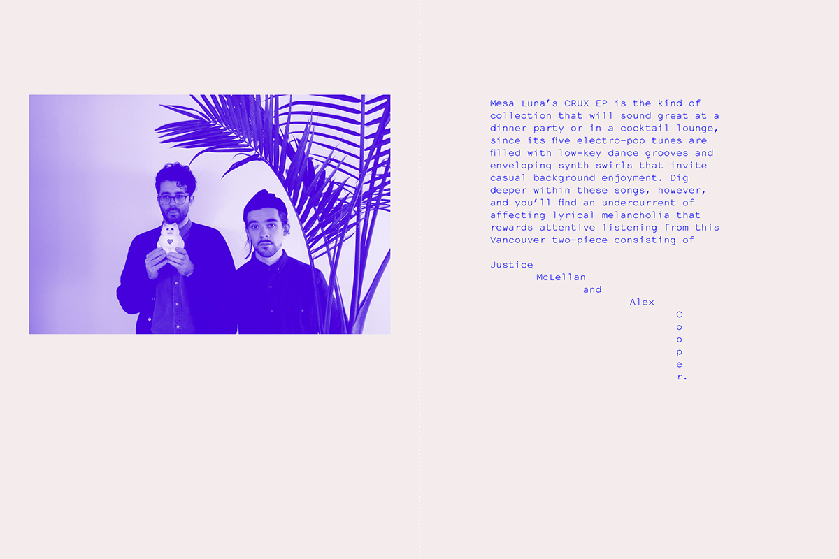
This idea came from the project below. The publication is actually only made up of one colour; purple. This also gives the publication consistency as well as making for an easy read.


Similarly, below is another example of how using a limited range of colours can be hugely successful in producing a consistent publication.


Inspiration for my contents page came from the publication below. I came across it whilst browsing Behance.
The simple elegance of the large page numbers followed by a brief explanation of the content gives for an ease of use that supports my aim of simplifying piste maps.

My colour palette
My chosen colour palette consists of Pantone 2645 C & Pantone 654 C.

I decided to use these two colours as they're very much suitable to the content of the book. Both colours can be related to the environment and temperature of a ski resort.
No comments:
Post a Comment