Yorkshire Sculpture Park is an open-air gallery in West Yorkshire showing work by British and international artists including Henry Moore and Barbara Hepworth. The park has a forever changing collection of work, however some installations and sculptures are permanent to the open-area.
We were set a task of redesigning the symbol or logo for the sculpture park (pictured above). To do this we are limited to making a simple symbol that works well next to the title of the park. This symbol must be influenced by the park and the work within it.
I have approached this brief by first putting together a selection of photos and first-hand sketches of the sculptures, buildings and surrounding area. I wanted to gather as much info about the park as i could, both visually and factual, before I started to produce symbol ideas.
I was blown away by the collection of sculptures around the park. With work from such amazing artists and sculptures, with the surrounding area combined, it makes for a spectacular experience and a hugely influential and beneficial source of research.
 |
| Gallery building |
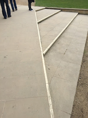
 One thing that grabbed my attention in particular however was not the sculptures but one of the buildings that housed artists' collections. This building is a modern chic design built with steel, glass and wood panels. It's beautifully elegant and clean and makes for a perfect gallery space. I've decided to use the image on the right as a starting point for one of my symbols, taking some of the lines and textures and simplifying it into a shape (image on the left).
 My second idea derives from the sculpture pictured below by Sol LeWitt. The sculpture is made up of 9 blocks of concrete bricks, ranging from large to small. On the right are some symbols I came up with that simplify the sculpture into one or two simple shapes. I then added black to some and text to others.

These symbols must work next to or with the original text of the existing logo. (pictured at the top of the blog post).
Above is the final outcome. I chose to use the second idea for the symbol and it was more effective and eye catching. It also has more relevance to the sculptural art found at the park.
On the right is the refined final outcome. I decided to make the symbol black as the existing symbol is also black and is very affective as it is. It is definitely more attention grabbing when filled in black. I further developed it by rearranging the words in the title 'Yorkshire Sculpture Park' by stacking them on top of each other. I did this as I felt it worked better with the shape of my symbol.


No comments:
Post a Comment