CORAL
In groups of 5 we were given a Company logo to rebrand in order to effectively communicate the market, target audience and sector in a contemporary context.
We started by choosing an appropriate typeface and then worked on that, experimenting with colour, kerning and other manipulations of the typeface.

 |
| Mind map of Coral and its history |
The next step was to play around with colour and create a logo or symbol. Through researching the company we found out that they have a large web base with apps and online games. From this we decided to try and use a pixel based pattern as a logo or symbol.
 For the actual typeface we came up with the font below. The kerning has been reduced so that the letters are touching to communicate the addictiveness of betting. We kept the colour blue as that is the original colour used throughout the company.
An alternative idea for the letter spacing was to make it inconsistent. This would communicate the unpredictability and chance involved in placing a bet.

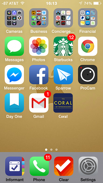
Final outcome: Our research resulted in the logo above. This is how the logo would appear on an iPhone app thumbnail. The colours blue and yellow were used as these are the colours associated with Leeds and the company Coral sponsors Leeds United. The final outcome is sleek and stands out well amongst other logos and app thumbnails.
Further photoshop development denoting how it would look on a phone screen when the betting app is downloaded.
No comments:
Post a Comment