Demonstrating awareness of grids in publication design and production
How and why are grids important in newspaper design?
Some newspapers follow strictly 6, 8 or 12 column grids. On the other hand some don't even use one and simply setting the columns according to the story.

The grid based system has been used in print for as long as presses have been running. Grids, which create structure and organisation, are used in print publications and to develop advertisements. The grid is used as a guide for how to place text and photos on a page.
My understanding of grids is that their extremely useful for a number of reasons. They allow for consistency throughout a publication such as a newspaper or magazine, allowing for a clear and legible layout that communicates the content in a clever way and also that a grid layout of a spread can be relevant to the tone of voice of the article or page.For example, a newspaper spread that is full of formal, serious content such as a murder or crisis, the grid layout will be simple and clear cut an not over complicate so that the information is clear and formal.

The two images above are both front page spreads for the New York Times magazine however they both contrast with each other in terms of tone of voice. The spread on the left is has a serious tone of voice and therefor, the layout grid is a lot more formal and organised. In contrast to this, The one on the left is a lot more light hearted and positive and so the grid hasn't been as closely followed and is more free flowing.

This contrast in tone of voice can be seen more clearly when comparing two different newspapers. The Independent and The Sun have both published a front page headline on the same topic; Jihadi John. The Independent front page spread has a very strong, hard hitting formal image with a blank black square and white type on top. The layout looks similar to a gravestone or war poem. In contrast, The Sun publication of the same story takes a very different approach. Even though the tone of voice is similar as it's a very sad story, the layout and fonts used give it a much more light hearted and more easily approachable image.
Mario Garcia
"The grid is the frame, or skeleton, on which we hang the flesh, in our case, the stories. A grid is what determines a well organised newspaper versus one where chaos reigns."
It is often seen as the secondary step to design, following typographic selection.
A grid can help to design the layout of a spread quick and easy, it frames and builds a basic architecture.
Lucy Lacava
"[A Grid] delivers a professional polished product to the reader."
"It facilitates and accelerates the layout of pages."
"On the contrary, learning how to use the grid to its full potential is a liberating experience. The absence of a grid brings chaos. A newspaper without a grid is like a building with no foundation."


The thing with grids is that although they are very strict in how the appear with straight, vertical lines editors will not always follow the grid with exact precision. For example, some columns of text can take up the space of two grid columns or one image can stretch across quite a few. This allows the editor more freedom to play around with and make the layout more relevant to the article content as apposed to the newspapers over all image.

The spread above uses a very free flowing grid that doesn't constrict the content as much. This allows for the spread to appear more approachable and easy to read. With more image than text, it makes for a friendly read.

The grid used by The Independent has 12 columns all the same width. This layout gives for a very formal and easy to read appearance. The images used are usually centred with the text surrounding it. This means the reader's attention is grabbed primarily by the image and then invited to read the surrounding text.
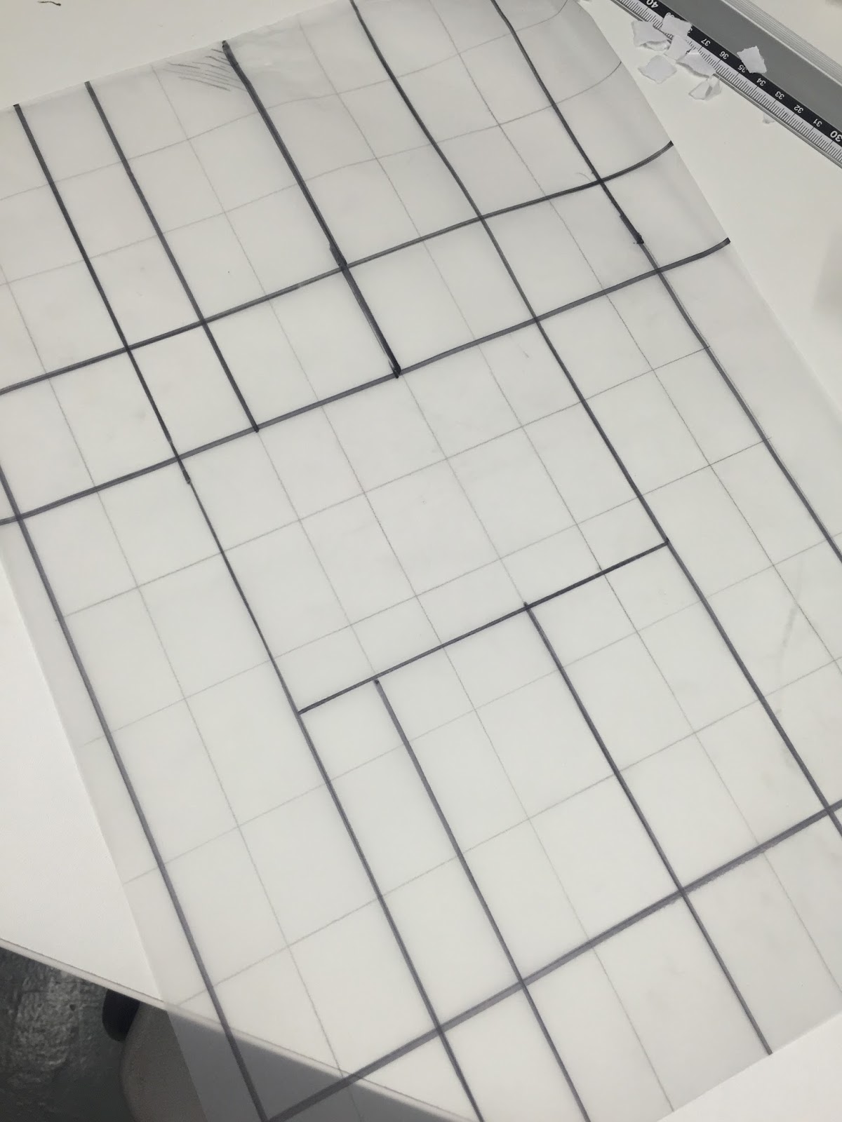
Task
We were set the task of choosing a newspaper spread and working out what grid has been used for the design and layout.

We worked out that this newspaper spread has used a grid of 7 columns, two of which are slightly narrower than the others. these columns help with the accessibility of the text. It makes reading and locating the next paragraph easier and quicker.


We offer a wide range of printing and publication services to suit your needs. From business cards and flyers to large format printing, we've got you covered.
ReplyDelete