For my wayfinding project, I have been exploring pictograms as I will be producing my own to be used on road signs.


In exploring pictograms, I have specifically looked at incredibly simple yet effective examples. What I aim to create is a series of pictograms that resemble well known buildings in Leeds and that can be used on road and pedestrian signs to direct people to them.


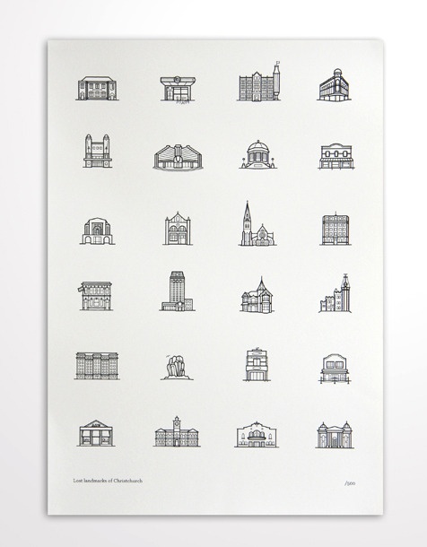
Above is a project by Yoon Jae Kim. He has produced a series of pictograms depicting common touristic references.
My Own Pictograms


My initial sketches of each of the buildings, simplified into a just a few lines.


My pictograms are of 4 iconic buildings in Leeds; The Broadcasting Tower, The University of Leeds, Sky plaza and Emmanuel church.


I've presented them in a number of different colour ways to see how I can make the pictograms more legible when on a road sign. I've used colour combinations that I learnt about when exploring colour theory of signage design. Black and yellow being one of the most contrasting combinations.

Inspire by Yoon Jae Kim, I decided to overlay my pictograms with the original image they were drawn from. There isn't much practicality behind these images as the pictogram is slightly lost in the image, but they make for an affective way of presenting the pictograms in an interesting way.

As the pictograms must be legible from a range of distances and in differentiating amounts of sunlight, the next step was to decide what stroke weight would be most appropriate to apply to road signs. My first thought was to make the strokes a lot heavier, and so they would be easier to distinguish from a distance. However, I came across a few problems when i did this; one being that the thicker lines actually changed the shape of the pictogram and therefore compromised with the overall aesthetics. The other, slightly more challenging problem was that the thicker i made the stroke weight, the harder it was to apply to road signs, this is because as I made the pictogram smaller to fit on the sign along side the text, the legibility was severely compromised and simply turned into a dot or smudge. Therefore, I have stuck with the original weight of stroke as it is both suitable for long distances as well as being able to change the size of the pictogram without compromising too much with the legibility.
No comments:
Post a Comment