Primary Research
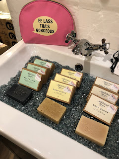
As this is my first packaging brief of the module, and in fact my first food packaging brief ever I thought I would start the process by walking around town documenting existing branding that caught my eye. I was looking for packaging that looked bespoke, hand made etc as this fits my brief.
I documented a number of styles, designs etc but most of them have a certain premium quality along side looking home made. Traditional, serif fonts are often used to give them historical context whilst making them look as though they have been around for a long time as a brand... This isn't important within my own ideas as this client has only just started and so it makes sense to explore more modern approaches to 'home-made' aesthetics.
A challenge of this brief is that the produce is housed within recycled jars which range in terms of size and shape. One of the main aims will be to design something that can be cleverly applied to each lid that achieves uniformity and consistency.
More Research on well-known brands
Similarly with previous examples, these ones below all use hand rendered fonts.


No comments:
Post a Comment